
Been standing in the middle of a tattoo shop once — ink in the air, hot coffee cooling on a ledge — and noticed how often someone will point to a rose and say, “That one’s for…” without finishing the sentence. The traditional rose tattoo carries those unfinished stories: it started on sailors’ chests and hands as a marker of home, love, and the things people waited for. Visually it's unmistakable — thick black lines, solid fills of red and green, and very little fuss — which is exactly why it kept traveling from ship decks into jukeboxes, storefront windows, and modern tattoo portfolios. Today the rose still reads both as a classic and a personal emblem: a symbol, sure, but also a tiny biography in ink.
Red roses on the hand
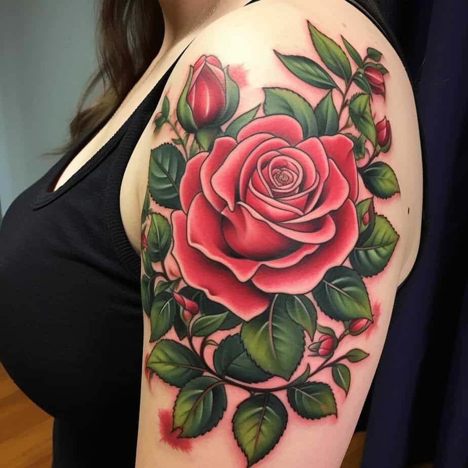
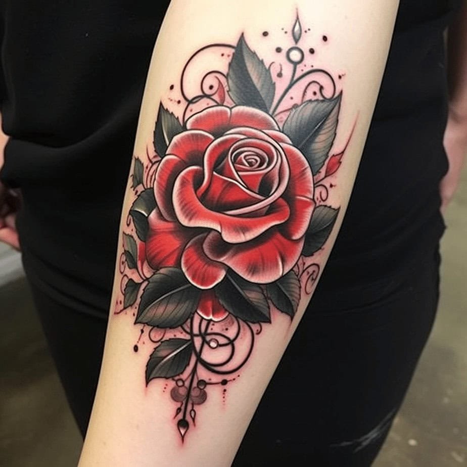
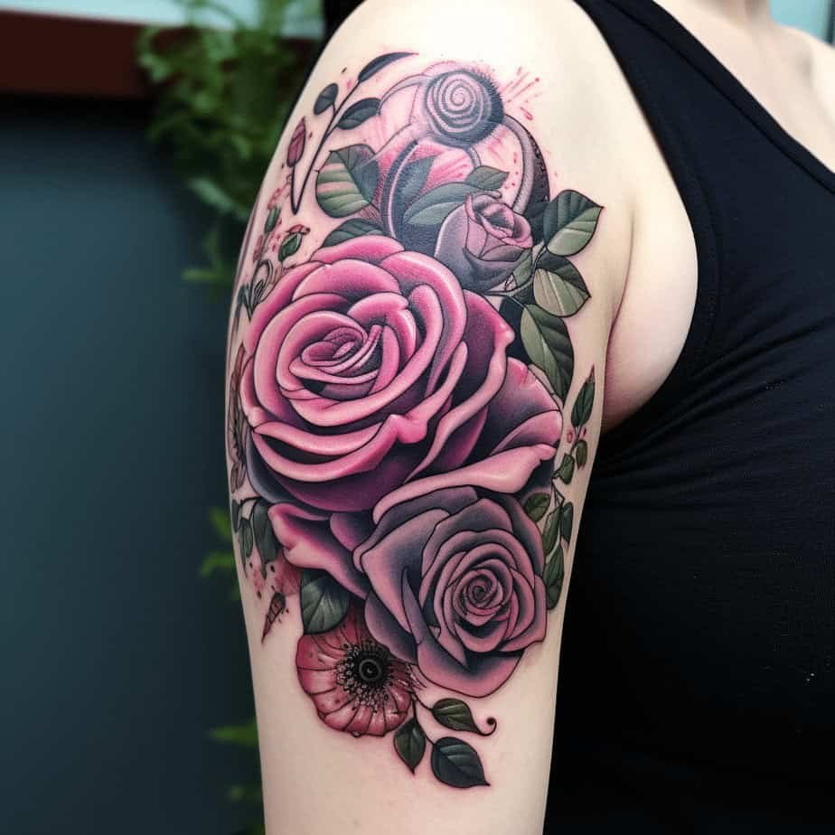
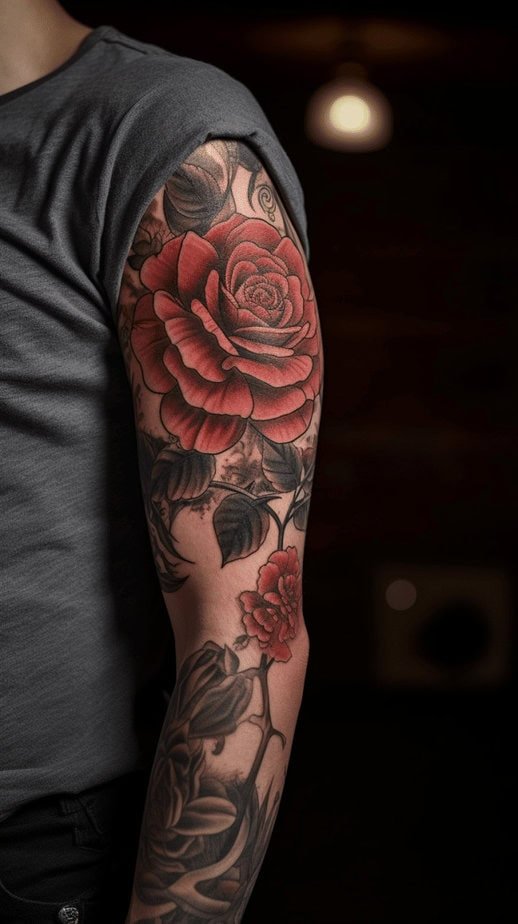
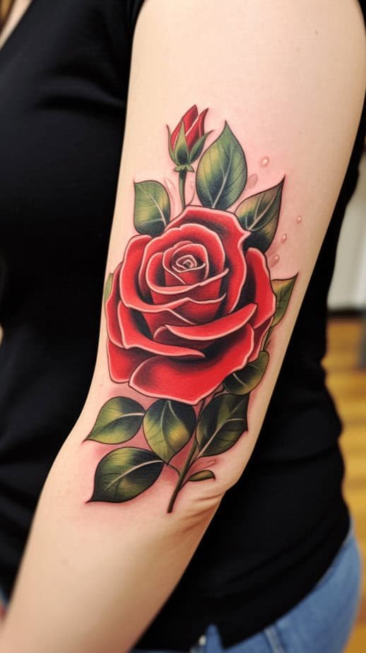
I remember catching sight of a palm-sized red rose as someone wiped a fresh stencil off a friend’s hand — the color snapped against their skin like a little declaration. These hand pieces use those bold outlines and flat reds so the design reads clearly from a distance, and the dark greens help the petals pop. What’s wild is how those tiny details — a soft dot here, a swirl there — turn a simple floral into something that looks like it’s been in a family for generations. And get this: because hands move and show so much of our life, a rose there often becomes shorthand for visibility — love you want the world to see, or a memory you carry literally in your palm.
Why the hand is a bold place for a rose?
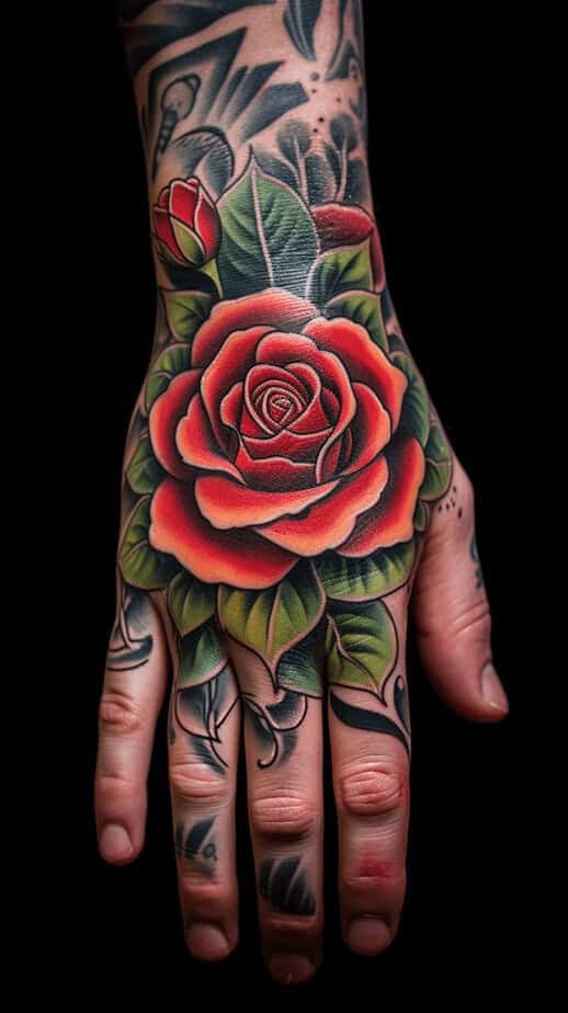
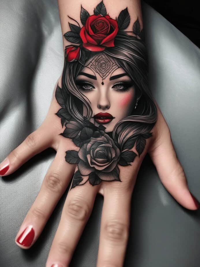
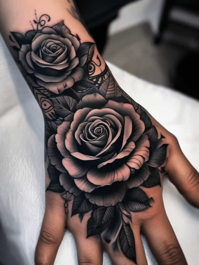
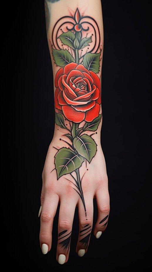
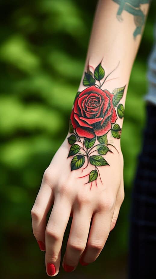
I started digging into why people choose their hands for roses and found it’s partly a reveal and partly politics. On the discovery arc of it: hands are public. Choosing a rose there is choosing to wear your story in a place everyone sees. Some people want that — the romantic who pins a love story to their knuckles, or the person who likes the idea that a pretty thing can also be a talisman. On top of that, hands demand crisp, confident linework because the skin’s texture and constant movement can blur fine details over time. So artists often go with wide outlines and stronger fills on hand roses — the result is a design that ages with boldness rather than fading into a cloudy memory.
Back blossoms

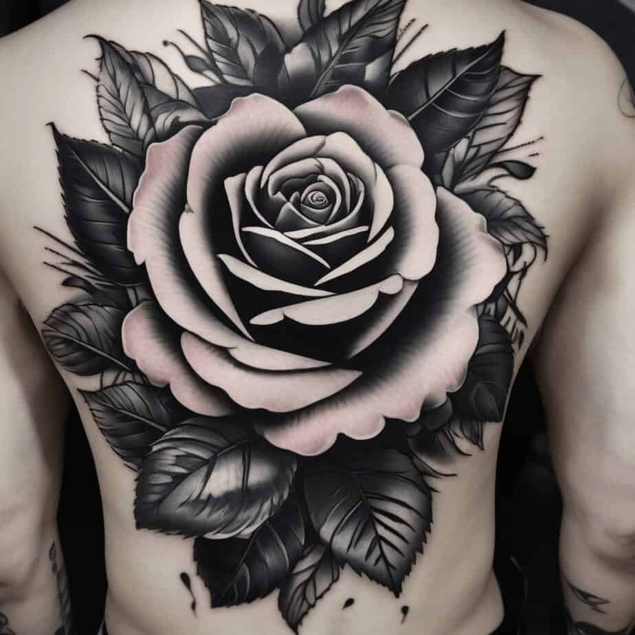

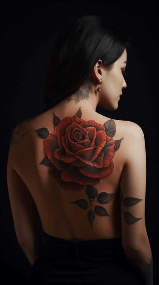

There’s a neat contrast between a small hand rose and a back piece: the back gives the artist room to play with scale and flow, and honestly the effect is almost cinematic. Compare a single bold bloom on a wrist to a sweeping bouquet across the shoulder blades and you see two different uses of the same symbol — one intimate, the other theatrical. On someone’s back the rose can curve with the body, tuck into the spine, or partner with vines that look like they belong there forever. That breathing space also allows for softer shading or extra elements — a swirl, a dot-field, a secondary bloom — which change the whole mood from strict old-school to something that feels a little more modern and painterly.
Keep it simple: a single rose
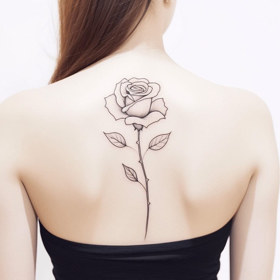
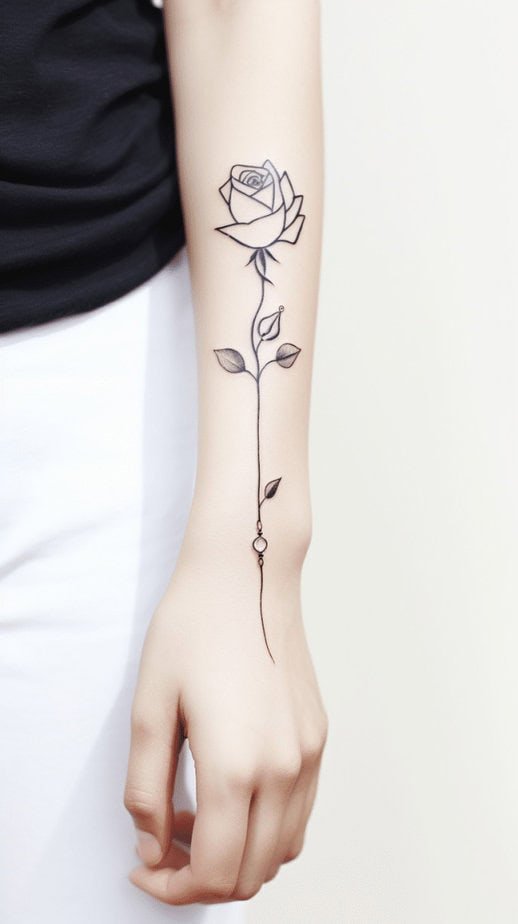
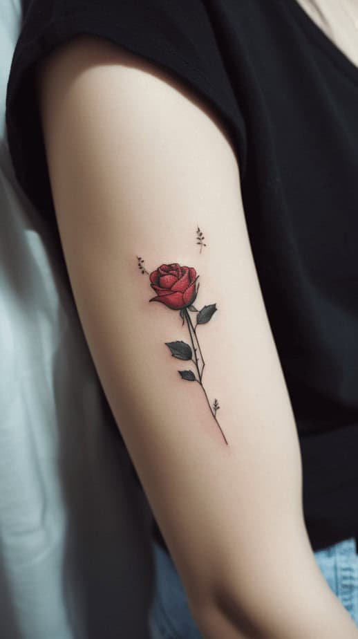
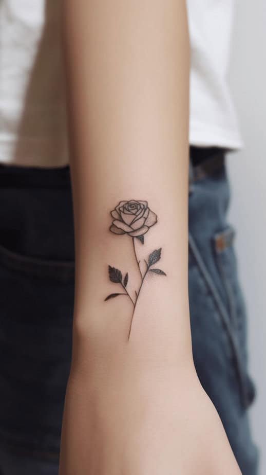
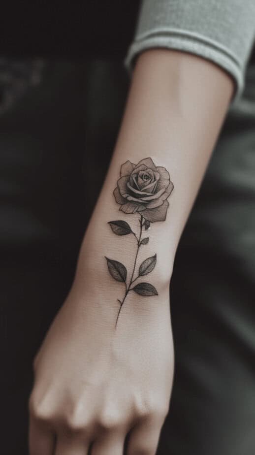
Picture a single stem, a modest bloom right below the nape or on the forearm — that minimal approach can be incredibly potent. I once watched a friend trace the line of a tiny monochrome rose on her wrist with her finger and say, “It’s quiet, but it’s mine.” The mini-statement works because the traditional style’s language — clear silhouette, focused petals, concise shading — reads even at a small scale. Plus, simplicity gives space for personal touches: a pendant added to the stem, a tiny dot cluster nearby, or a specific placement that makes the rose feel like private jewelry instead of loud body art.
Silhouette: black-and-grey rose details
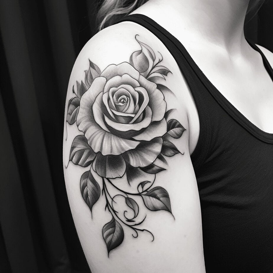
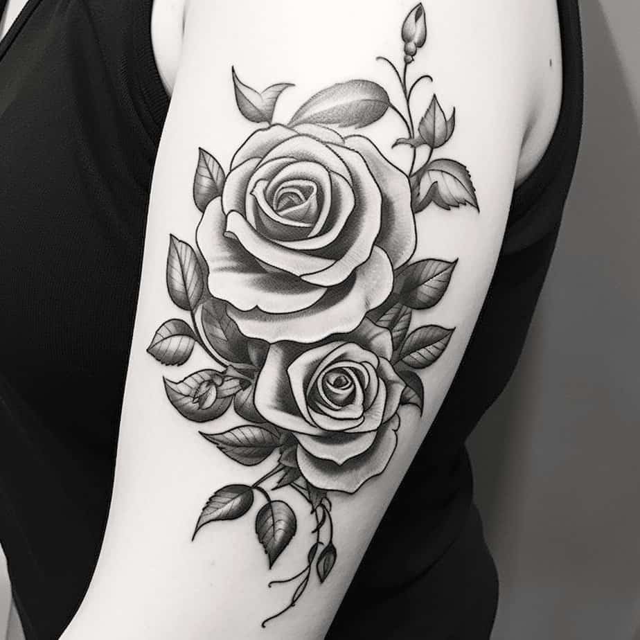
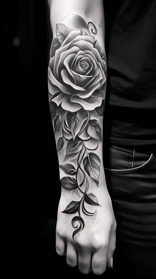
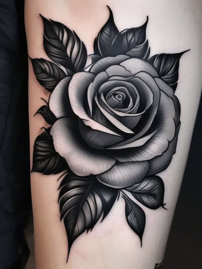
There’s a gentle revelation when color steps away and all you’re left with is black, grey, and texture. What really got me about these pieces is how much expression comes from shading alone: the curl of a petal, the shadow between leaves, a glossy-looking center all emerge through careful gradients. The monochrome palette also adds a certain timelessness — it reads archival, like a photograph handed down. On top of that, black-and-grey roses tend to pair beautifully with dot work and filigree, so even without color they feel rich and layered.
Not old-school — reimagined

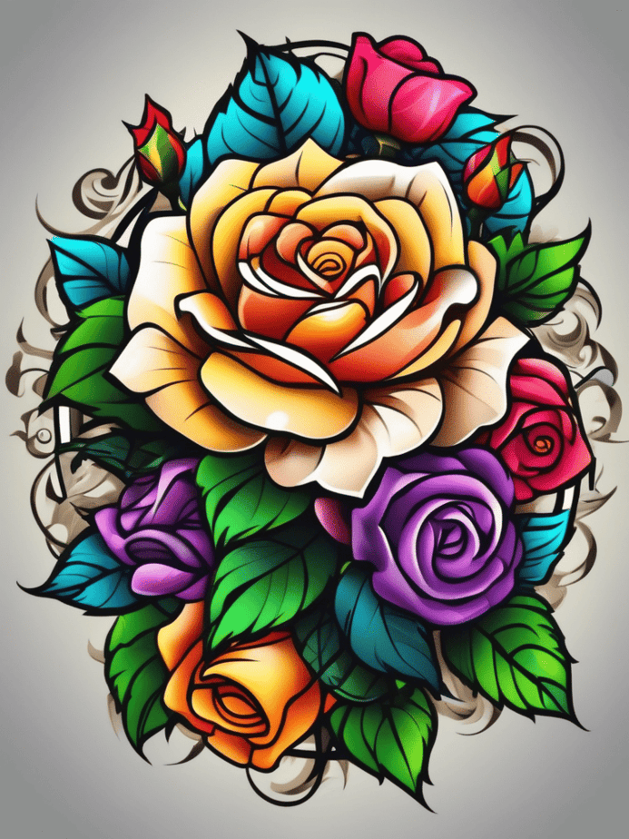
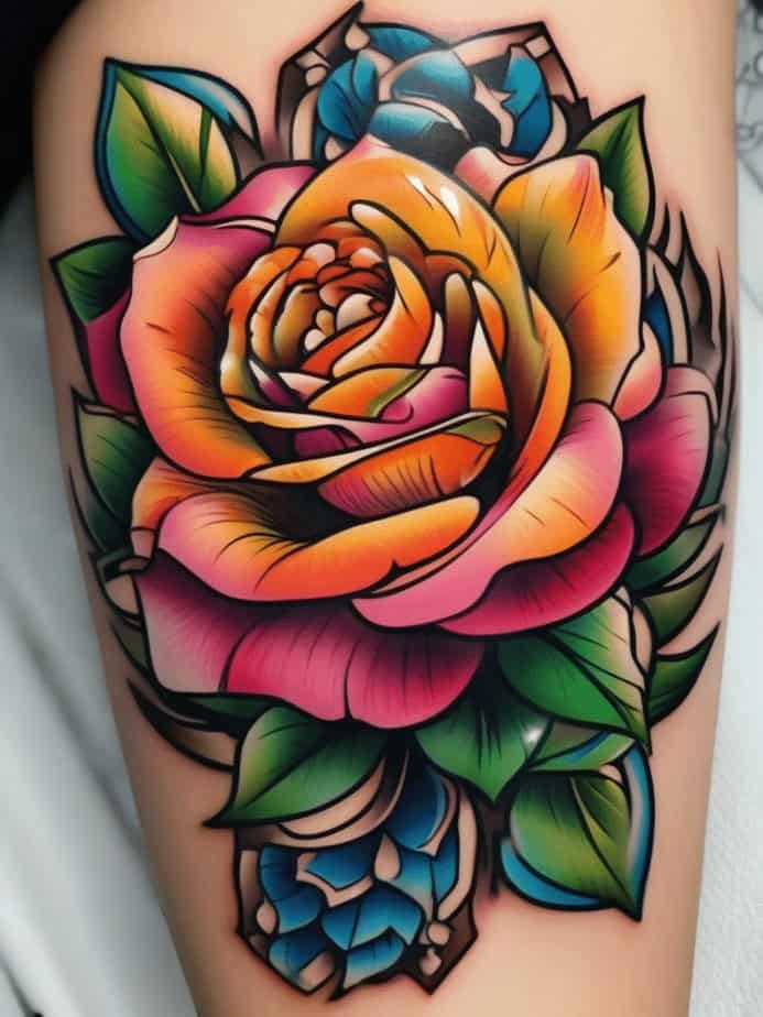
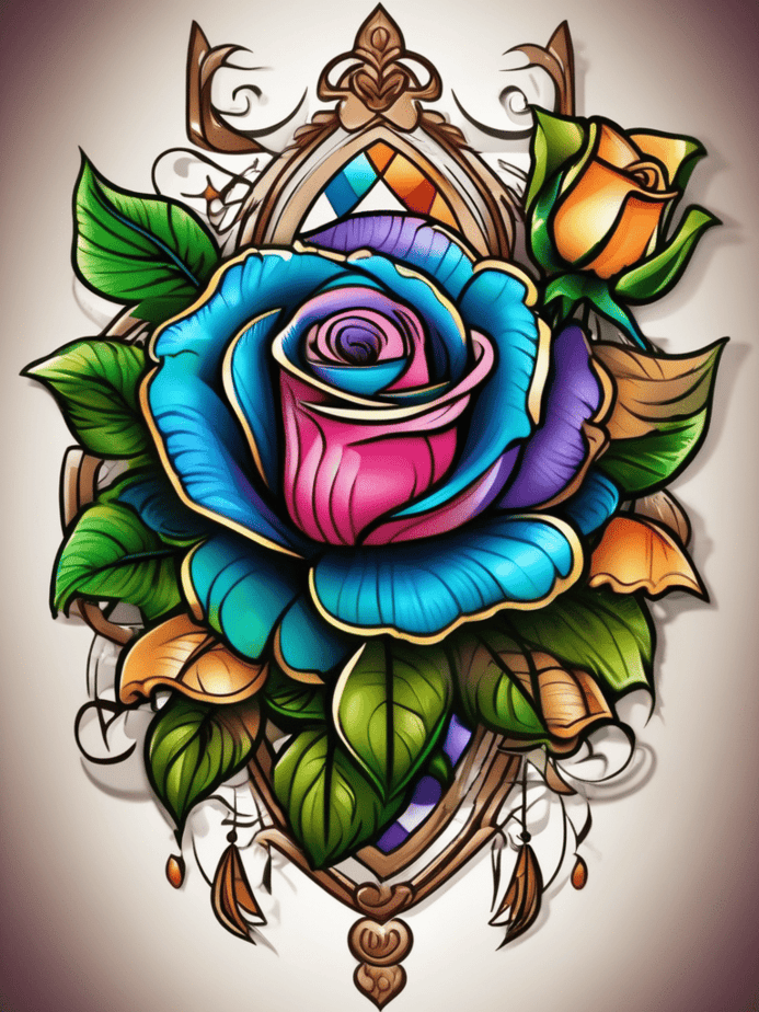
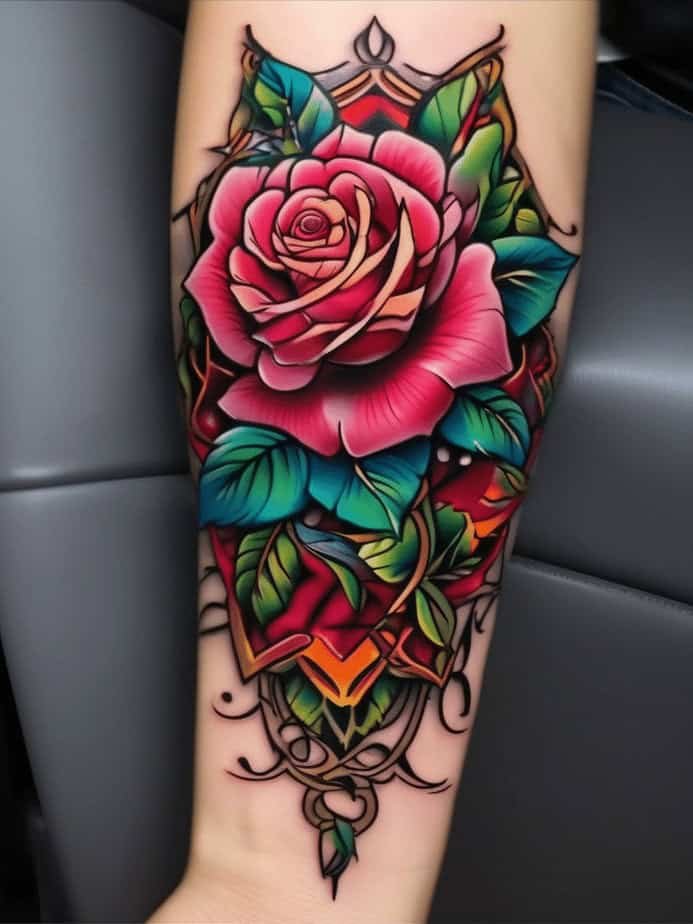
On a discovery arc of style, neo-traditional roses feel like someone took the old-school rulebook, smiled, and added paint. The colors go beyond the classic red-and-green: think sunset gradients, teal highlights, and jewel-toned leaves that make the whole thing hum. The outlines are still confident, but the fills can be painterly, with soft blends and layered hues that create depth. The other part is that these pieces let artists play with composition — geometric shapes, unexpected color pairs, or tiny narrative elements — so the rose becomes not only a symbol but also an illustration of the artist’s voice.
Wrap-Up
If I had to give the rose a one-word mood it would be: enduring. Whether you want a tiny reminder on your wrist, a loud red bloom on your hand, a grayscale portrait on your shoulder, or a neon twist with neo-traditional colors, the rose adapts while keeping its old meaning close to the surface. For me, those qualities make it feel less like a trend and more like a lifelong companion — something that ages with you and keeps telling pieces of your story.