
So I stumbled on this the other day and immediately wanted to share — poppy tattoos are quietly dramatic, the kind of thing you notice twice because they hold a story. Some people pick flowers for pure aesthetics, but poppies tend to come layered: peace and remembrance on one hand, a little fire and passion on the other. Whether you want something tiny and private or a colorful chest piece that feels like armor, there’s a poppy vibe for that — and I rounded up a bunch to spark ideas.
Fiery sternum bouquet

Credit: @yerae_tt
Picture lying back in the studio, chest open, while a streak of gold-orange blooms curves along your sternum — that’s the energy here. This design mixes California poppies with goldfields and lupines, so it’s not just one shape repeating; each flower brings its own texture and a slightly different shade. Because the sternum sits between private and dramatic, the colors and composition feel confident without shouting, which is why this placement is so satisfying when you want something intimate that still reads as art.
Thinking about a ribcage poppy?
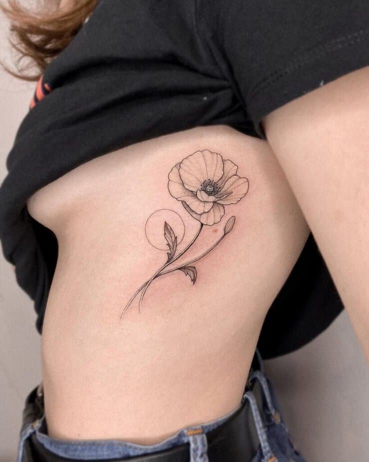
Credit: @gayagatto
Turns out ribcage pieces wear elegance really well — they move with you, peek out with certain tops, and have this secretive energy. A simple, sleek poppy along the ribs keeps things refined: clean lines, minimal shading, and a silhouette that flatters the body. If you want something that can be covered but still makes you feel special when it’s revealed, this is a classic move.
All-red flower cluster
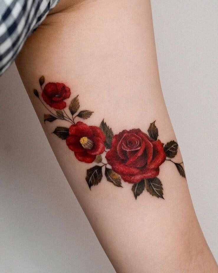
Credit: @zihong_tattoo
What really got me with this cluster is how red ties different flowers into one mood — a rose, camellia, and a poppy together turn into a single statement about strength. Using the same hue across distinct blooms makes the composition feel cohesive but layered, like a chorus instead of a solo. If you want your tattoo to shout resilience or passion, working in an all-red palette does the trick without needing heavy detail.
Try a blue poppy
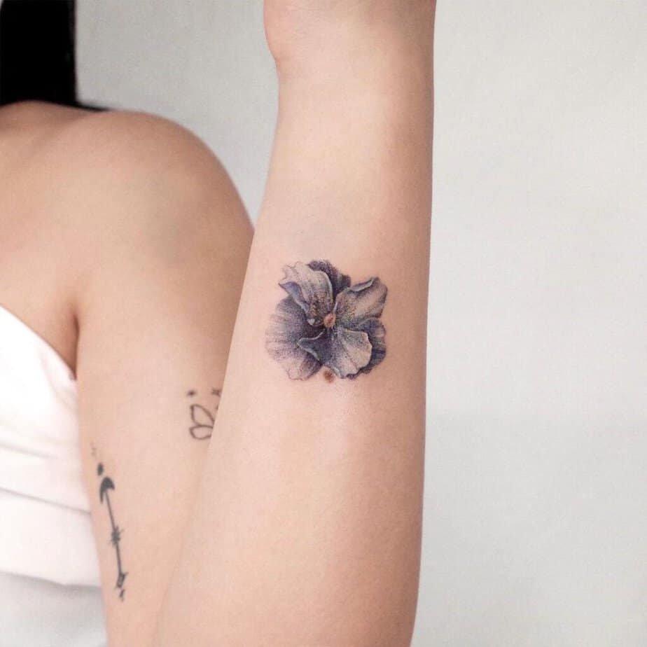
Credit: @tattooist_iruda
Here’s the thing: blue poppies are unexpected, and that surprise is their whole charm. They lean into themes of remembrance and quiet sacrifice while also reading as artful and uncommon on skin. If you want a poppy that won’t look like everyone else’s and has a slightly wistful vibe, blue is a beautiful way to go.
Poppies with ladybugs for a whimsical touch
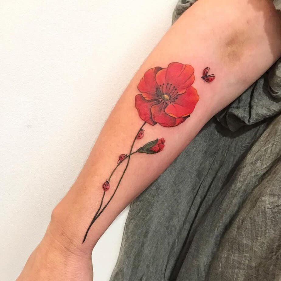
Credit: @madeleine_inked
On top of a soft poppy, adding tiny ladybugs flips the tone to playful and almost storybook-like. Those little critters give scale and movement — suddenly the flower isn’t static, it’s a scene. If you’re into tattoos that feel like a secret illustration on your skin, these details are the sort that people notice and smile at.
Not subtle — watercolor poppies
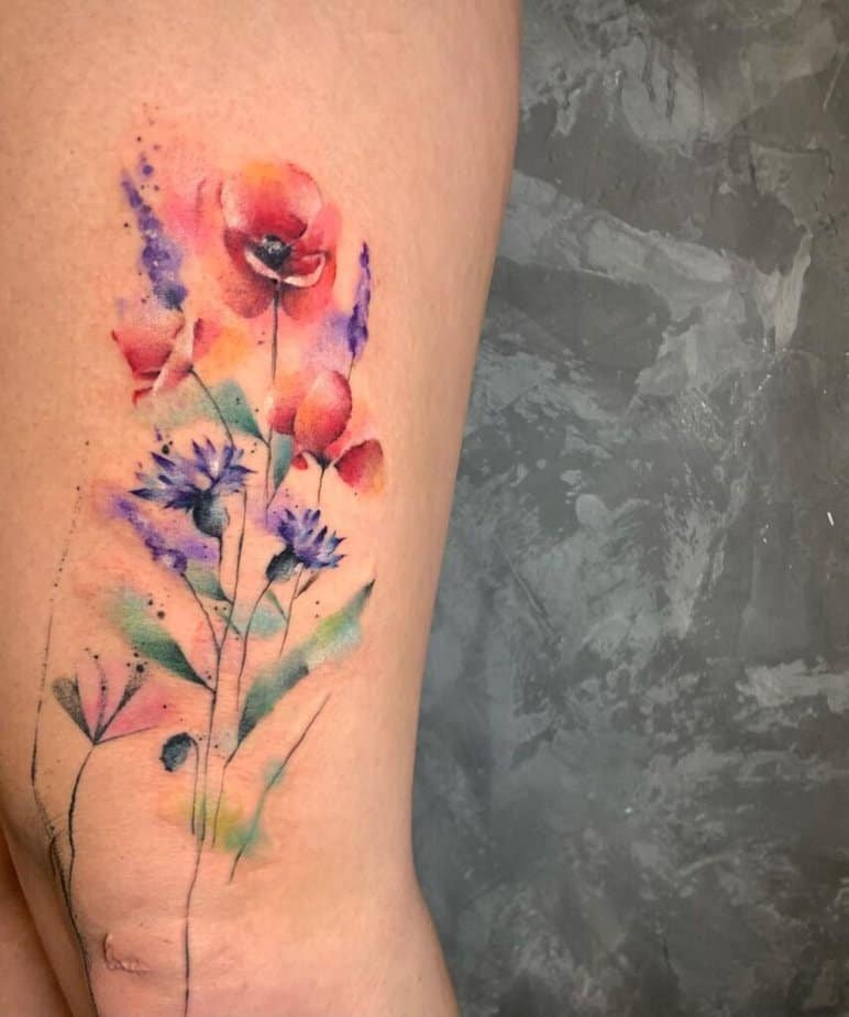
Credit: @gabink.art
Honestly, watercolor poppies are for the person who’s game to be vivid. The pigment flows and blends in a way solid lines can’t replicate, so the piece looks like a painting more than a tattoo. If you want to stop conversations and let color do the storytelling, this approach is pure theater — messy edges, soft fades, and a joyful refusal to be tidy.
Wrist-sized charm

Credit: @jehlickou
Small wrist tattoos are deceptively versatile; they can be seen every day or covered with a bracelet when you need to. A poppy here reads as delicate and wearable — like jewelry that also means something. If you want a daily reminder of whatever the poppy stands for to you, the wrist is a gentle, constant place for that nod.
What about red-ink lines?

Credit: @iren.odynets
Compare this to the more common black work and you’ll see red ink has an edge: it softens the line but makes the piece feel carved-in, almost tender. Fine-line red tattoos have a warmth that black can’t replicate, which is why they feel both intimate and bold. If you like the idea of ink that looks like a mark made by sunlight or a ribbon, red is worth considering.
One continuous line
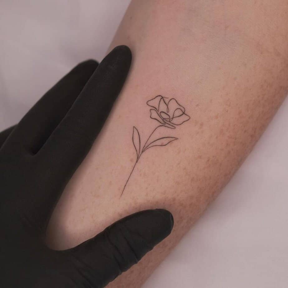
Credit: @unotattoonyc
A single-line poppy is minimalism with a personality — the whole flower formed without breaking the stroke. That approach keeps the design light and modern while still carrying symbolic weight. For folks who want an easy-to-hide, boss-approved look that still feels intentional, single-line is a brilliant compromise.
Wear three blooms

Credit: @kumigems
There’s a discovery in choosing three: each bloom can stand for a person, a moment, or a lesson, and together they form a small narrative on your skin. A trio reads as deliberate rather than random, and spacing them just right gives the composition a rhythm. If symbolism matters to you, arranging multiple flowers lets you build a little library of meaning in one tidy design.
Poppy + crescent moon combo

Credit: @bery_forestink
And get this: layering symbols changes the read entirely — pair a poppy with a crescent moon and you add themes of cycles and fresh starts to the remembrance vibe. The moon’s curve complements the flower’s round petals, so there’s a natural visual harmony too. It’s a small design decision with a big payoff in depth.
Hidden canvas — back tattoos
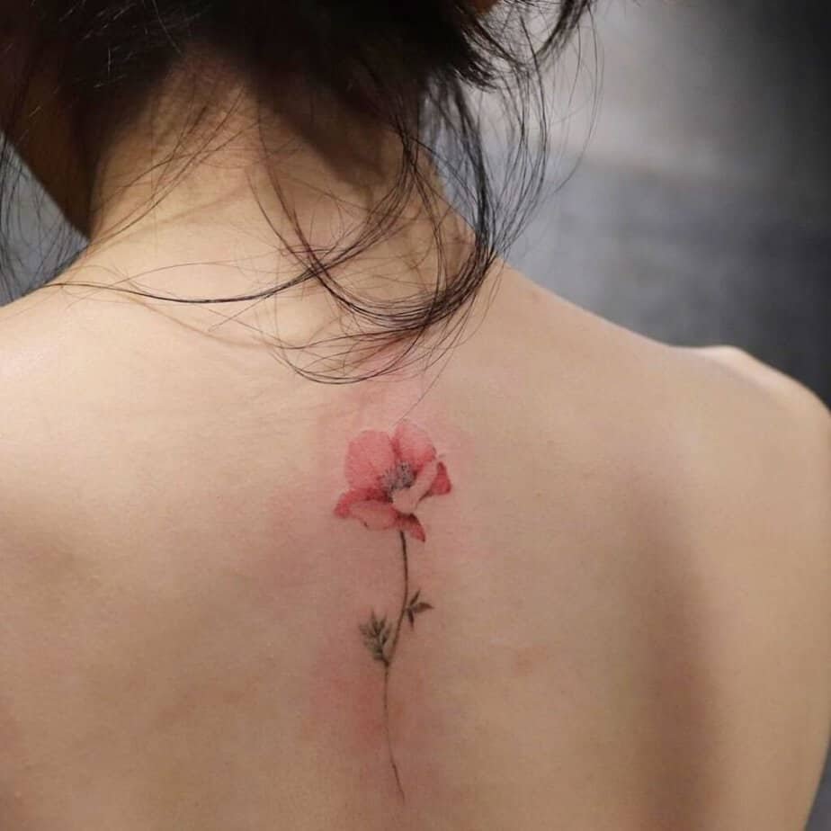
Credit: @black.seahorses
Large back tattoos give you breathing room to experiment with scale, negative space, and storytelling. A sweeping poppy composition across the shoulder blades or spine can feel like wearing your memory or your mood — dramatic when you want it to be, private otherwise. If you’re craving something that grows with you and reads differently depending on your outfit, the back is a patient, generous place for that.
Flower vine on the forearm
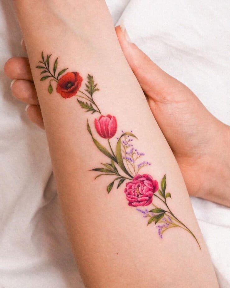
Credit: @zihong_tattoo
Here’s the fun part: weaving poppies into a vine lets you mix species — a rose for elegance, baby’s breath for softness — and still have the look read as one piece. Forearm placement means the art moves every time you reach or gesture, so the vine comes alive. It’s a great choice if you want a tattoo that plays well with others and tells a small ecosystem story.
Could a fine-line bouquet be yours?
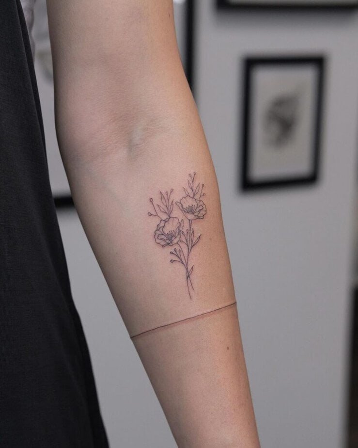
Credit: @waldemartattooing
Fine-line bouquets read like sketches — delicate, intentional, and endlessly chic. Because they rely on crisp lines more than heavy shading, they’re perfect for visible placements where you want subtlety and polish. If you appreciate refined details and a tidy aesthetic, this is the energy to chase.
Matching poppies
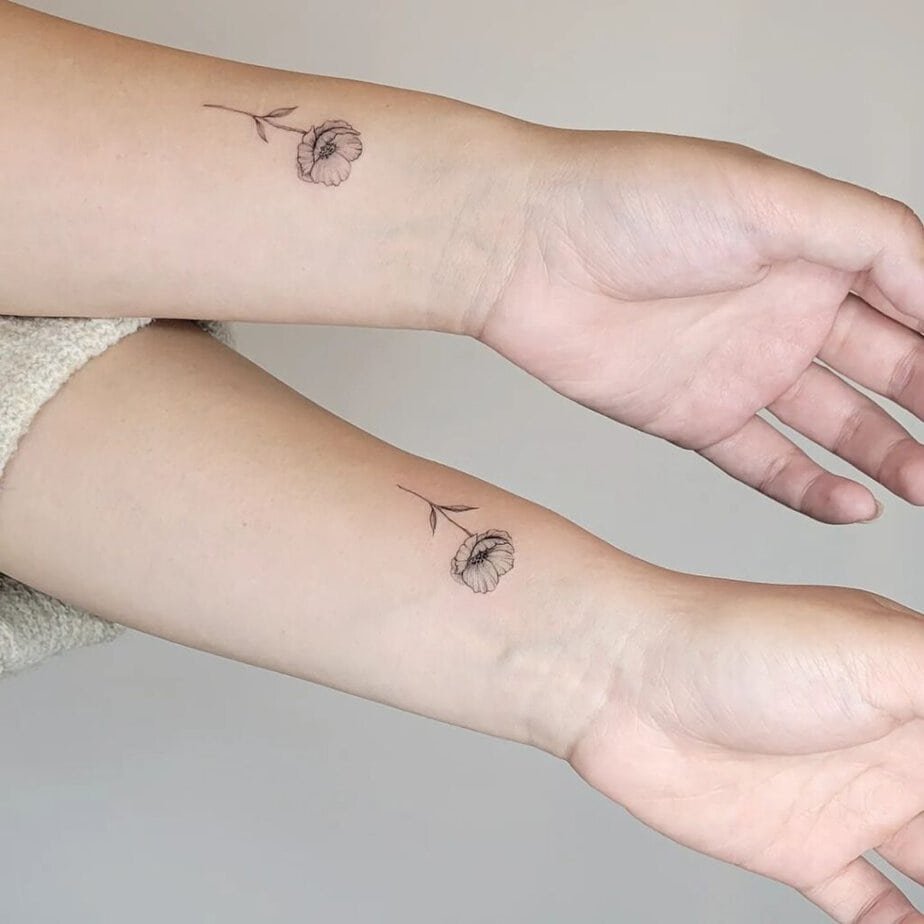
Credit: @ellie_s.tattoo
Matching tats feel like a quiet pact — whether with a friend or partner, a poppy design can be both symbolic and wearable. Because poppies are versatile, you can mirror shape while varying size or color for a complementary, not identical, look. If you want a shared mark that’s elegant rather than gimmicky, poppies strike a sweet balance.
Start tiny

Credit: @lagom.tuzla
Tiny tattoos are such a great first step — you get to try placement, color, and your pain tolerance without a huge commitment. A miniature poppy with a single wash of color reads like a personal sigil: discreet, meaningful, and endlessly cute. If you’re nervous about the leap, going petite is smart and satisfying.
Forearm fine-line poppy
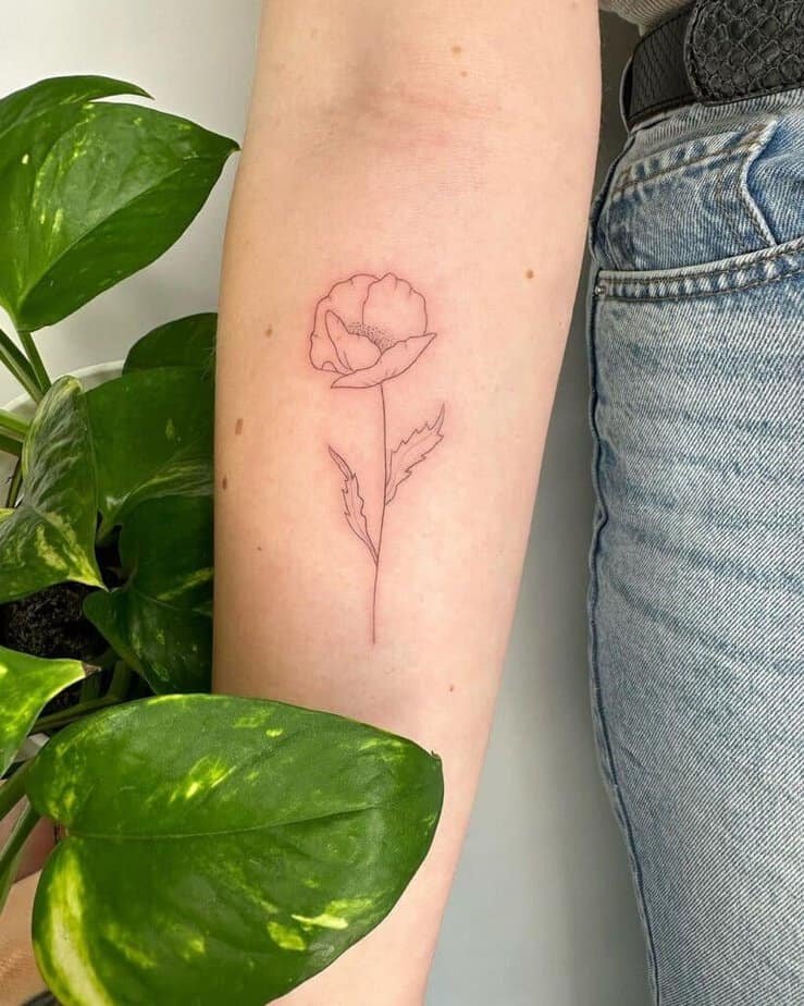
Credit: @francielitattooart
Plus, the forearm gives artists enough room to breathe while keeping the piece visible and conversational. Fine-line poppies here feel elegant and modern — they hold detail without feeling heavy. If you love showing off your ink in everyday moments, this placement is hard to beat.
Dainty, not delicate-less

Credit: @truecanvas
There’s a real finesse to dainty designs: they suggest fragility without being fragile, like a handwritten note you can tuck away. These pieces suit fingers, behind-the-ear spots, or the inside of the wrist where they act like tiny, personal talismans. If your aesthetic leans quiet but meaningful, you’ll appreciate how much personality a small poppy can hold.
Shoulder stem simplicity
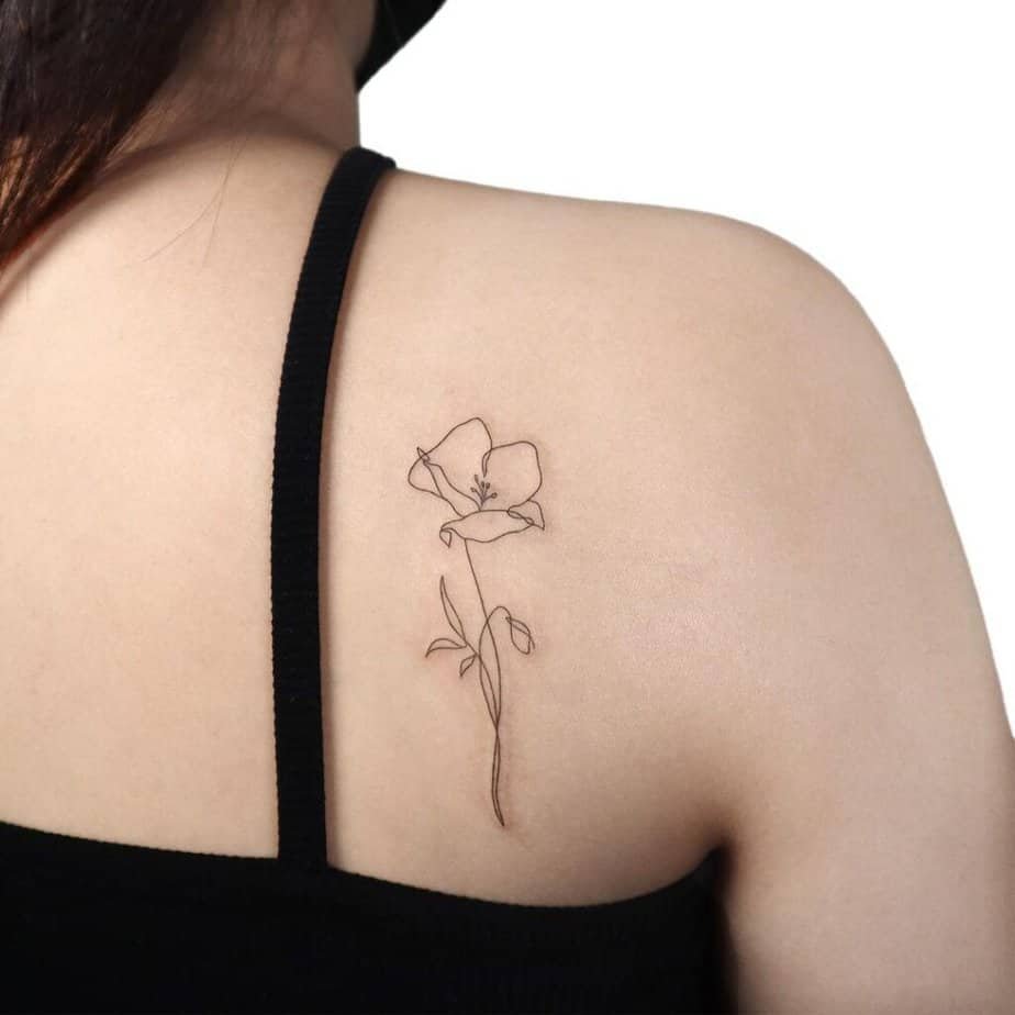
Credit: @gigi_tattooer
A single stem on the shoulder looks effortless and modern; it follows the natural slope and flatters the silhouette. Fine-line execution keeps the look streamlined, nothing extra, just a clean botanical gesture. This is a go-to if you want something quiet that still reads like an intentional style choice.
Feeling a little color?

Credit: @vane.tattoo_
What’s wild about small pops of color is how they change perception: a tiny red dot or a petal wash can make a simple linework piece feel curated. People will ask about it, and that’s where the story—the reason you chose that hue—gets to exist. If you like ink that sparks curiosity, a modest splash of color is a sly way to do it.
Realism, up close
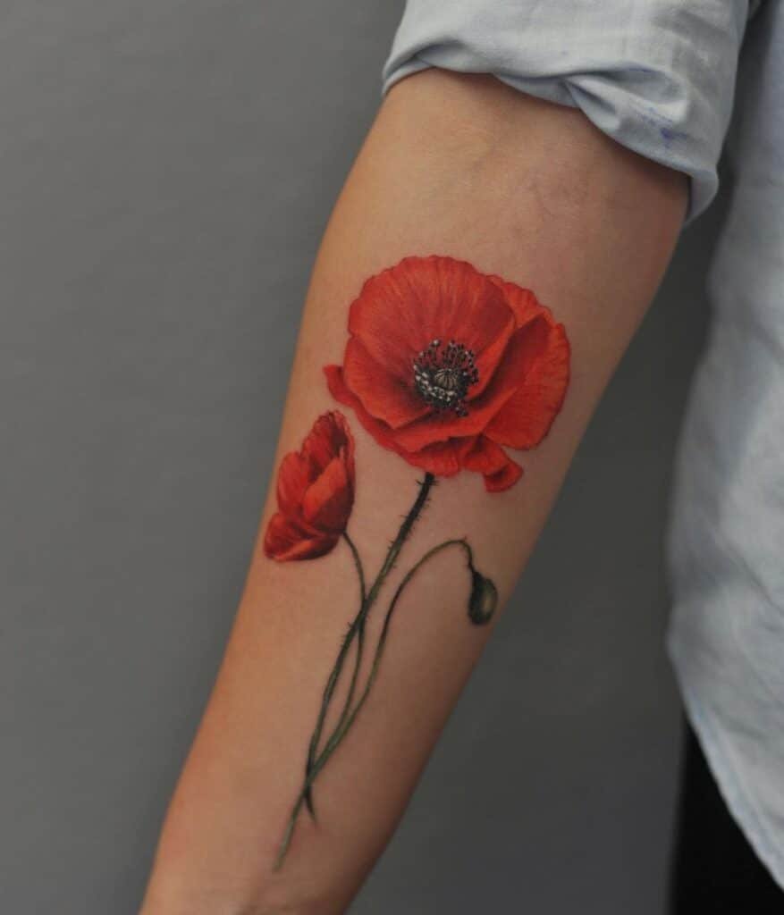
Credit: @max_wood_art
Realistic poppies demand time and a practiced hand, but the payoff is lush and tactile: petals that feel touchable and shadows that read like a photograph. These pieces are commitment-heavy, both in price and in the hours under the needle, but they age beautifully when done well. If your dream is a tattoo that could be mistaken for a painting, realism is the path.
Keep it black and white
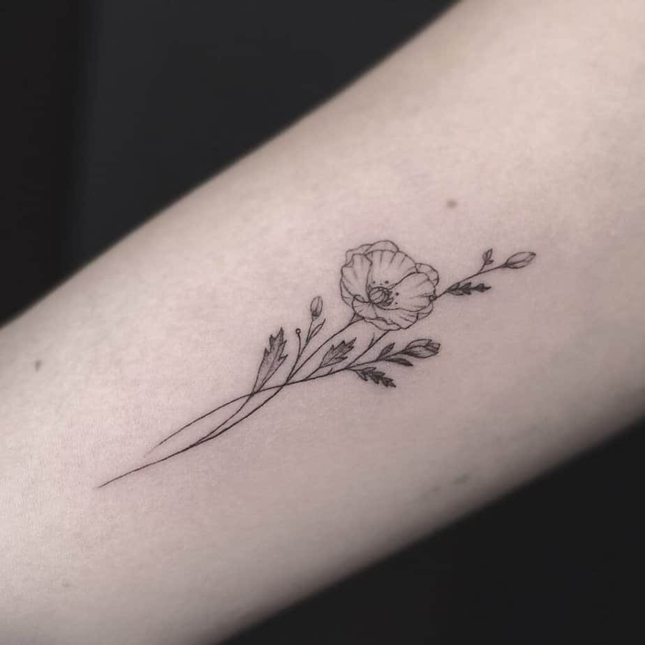
Credit: @studio_emmanuel_mazzeo
Black-and-white poppies never go out of style — they’re timeless, chic, and a little more forgiving as skin changes. The simplicity of monochrome makes details pop and keeps the silhouette readable from a distance. Whether you’re a first-timer or a seasoned collector, this classic route is always a solid conversation starter.
Little note from me
I love how many directions a single flower can take you — delicate, dramatic, hidden, or loud. If one of these made you sit up, save it, tweak it, and bring that idea to an artist who vibes with your aesthetic. Tattoos stick with you; let the poppy you choose feel like a small, stubborn truth you’re happy to wear.