
I'll be honest, I used to think a Caduceus tattoo was a one-size-fits-all homage to medicine — simple staff, serpents, done. Then I started looking closer at how artists play with placement, ornamentation, and tiny personal touches, and now I'm kind of obsessed. Whether you're honoring healthcare, nodding to Hermes, or just love the aesthetic of two snakes coiled around a staff, there are so many small choices that change the whole vibe. This little guide walks through ideas by where you might put the design, so you can picture it on your own skin.
Arm-ready Caduceus designs
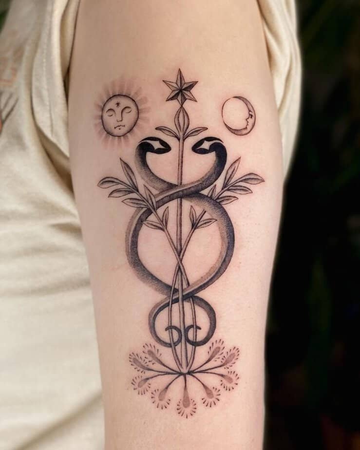
Credit: spirit.of.salt
I love how an arm tattoo reads like a little story you can peek at throughout the day — it’s visible but not screaming for attention. In that same vein, some arm pieces lean into ornamentation: tiny moons, suns, and leafy branches weave around the staff and give the design a softer, more mystical feeling. Turns out those little extras do a lot of emotional work, especially if you want the symbol to feel personal rather than strictly emblematic.
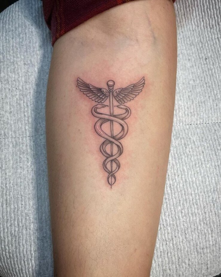
Credit: myart_carmen
On the other end of the spectrum, there are compact, classic takes that tuck neatly on the inner forearm or wrist — they’re tiny but sturdy, and they age well because there’s less surface to stretch or blur. And get this: some artists top the staff with a sketched heart and layer in dotwork for texture, which makes the whole thing feel both delicate and intentional.
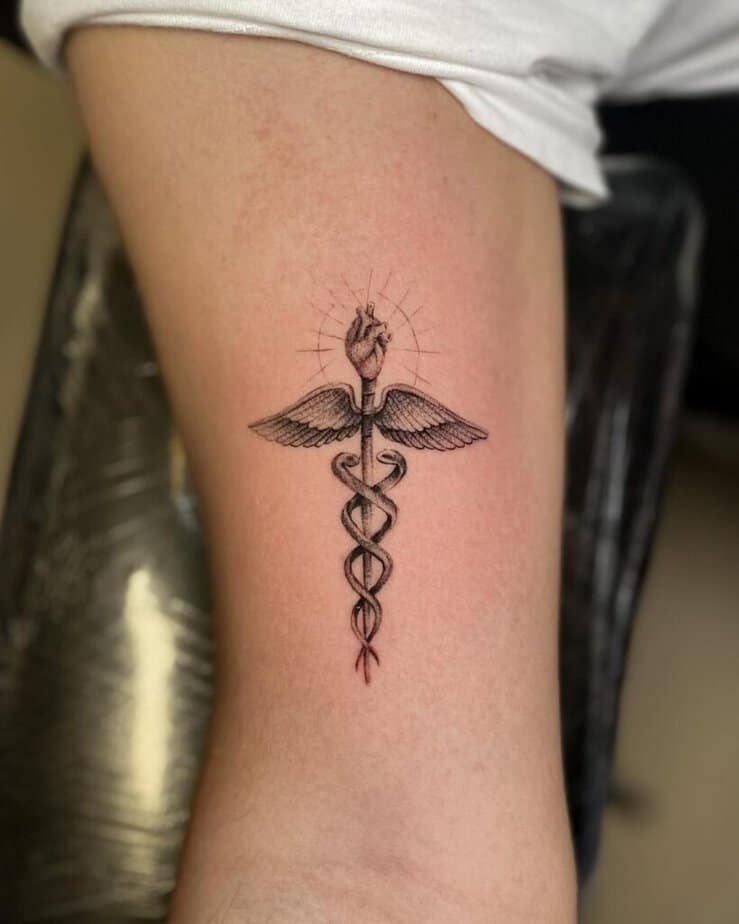
Credit: cediebelly
For people managing chronic conditions, an arm Caduceus can double as a discreet medical alert — subtle to look at, but clear to a professional when it matters. And if you want something softer, folding in flowers or little geometric ornaments gives the same core symbol a gentle, personalized spin.
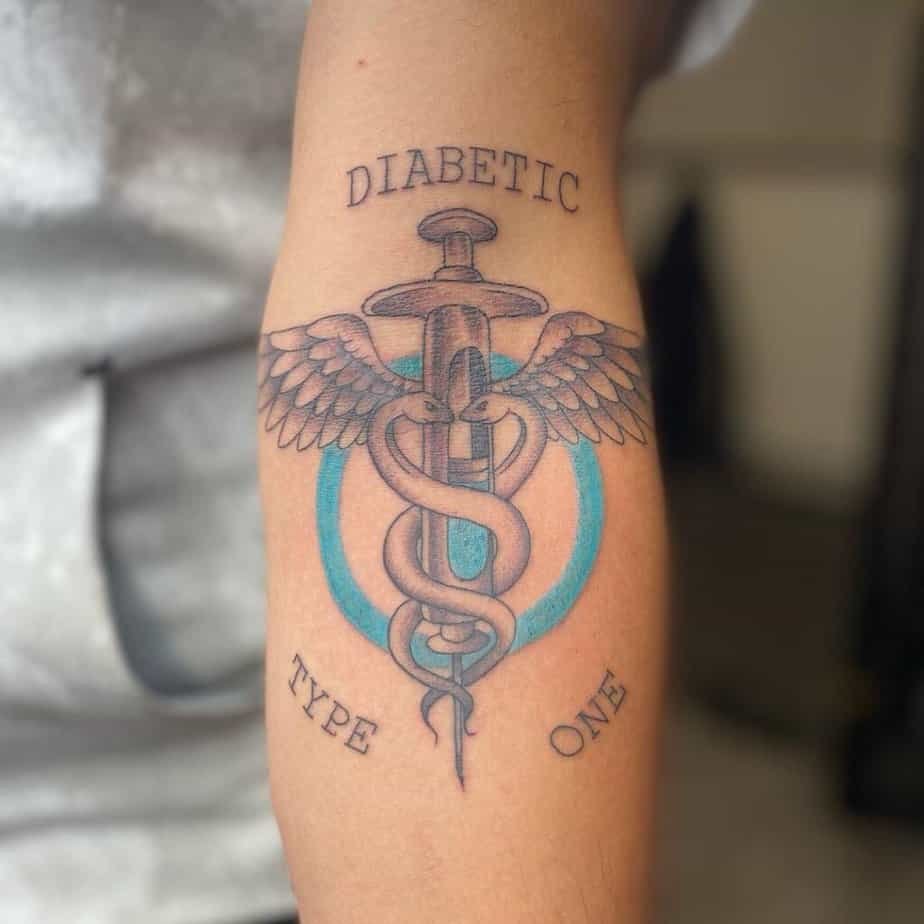
Credit: livitattoos
What does a Caduceus look like on your back?
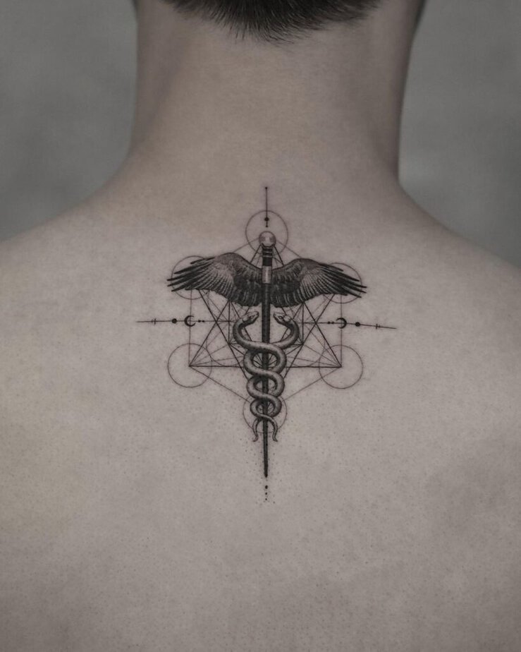
Credit: tattooist.zink
I started scrolling through back pieces and realized the back is basically a private mural: generous real estate lets an artist add thoughtful shading and layered geometry without crowding the symbol. What really got me was a version where the caduceus sits inside a field of triangles and circles — that geometric backdrop modernizes the whole thing and makes the staff feel like part of a larger design language.
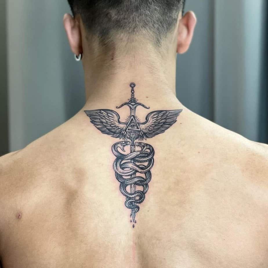
Credit: ng.ringvean
Then there are the classic, full-back takes: big wings, bold linework, heavy black-and-gray washes. Those pieces have a presence that reads from across the room, but they still keep the symbol respectful and recognizable. On the flip side, a tiny caduceus dropped into an abstract pattern can feel unexpectedly bold — the surrounding shapes amplify the little symbol so it punches above its size.
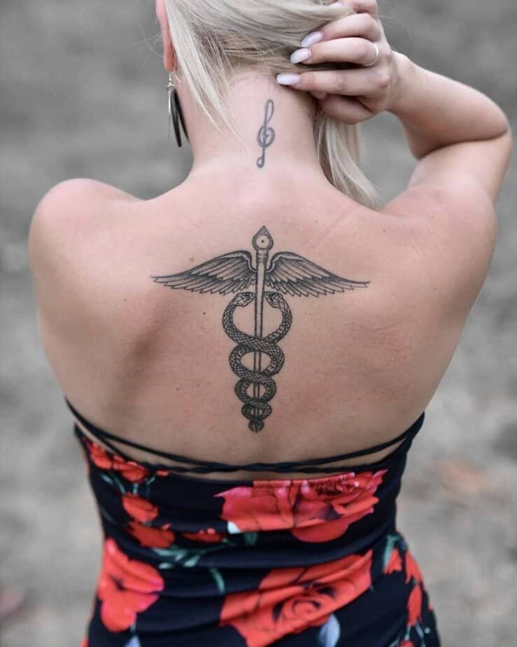
Credit: geometrink
Chest pieces that command attention
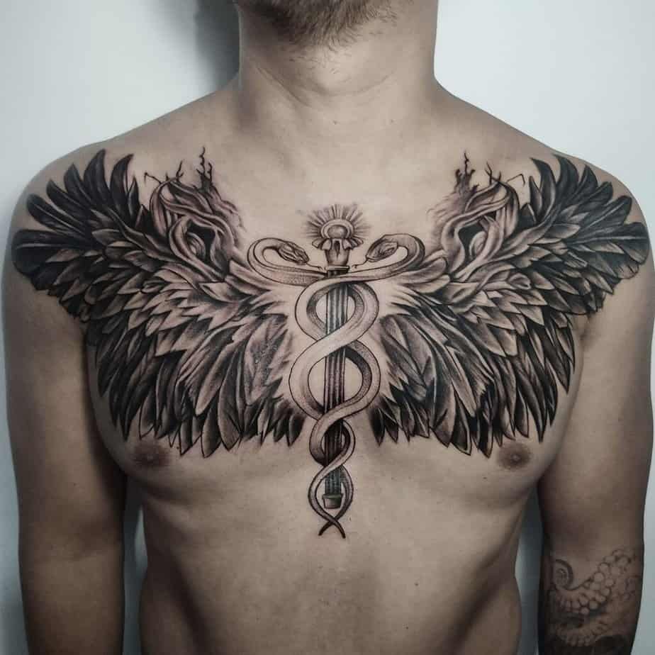
Credit: deng.cortez
Some chest designs are built to be dramatic — imagine the staff centered with wings that unfurl across the pecs. The effect is cinematic: it reads like protection and aspiration at once, and yes, those pieces can take time in the chair, but the payoff is unmistakable.
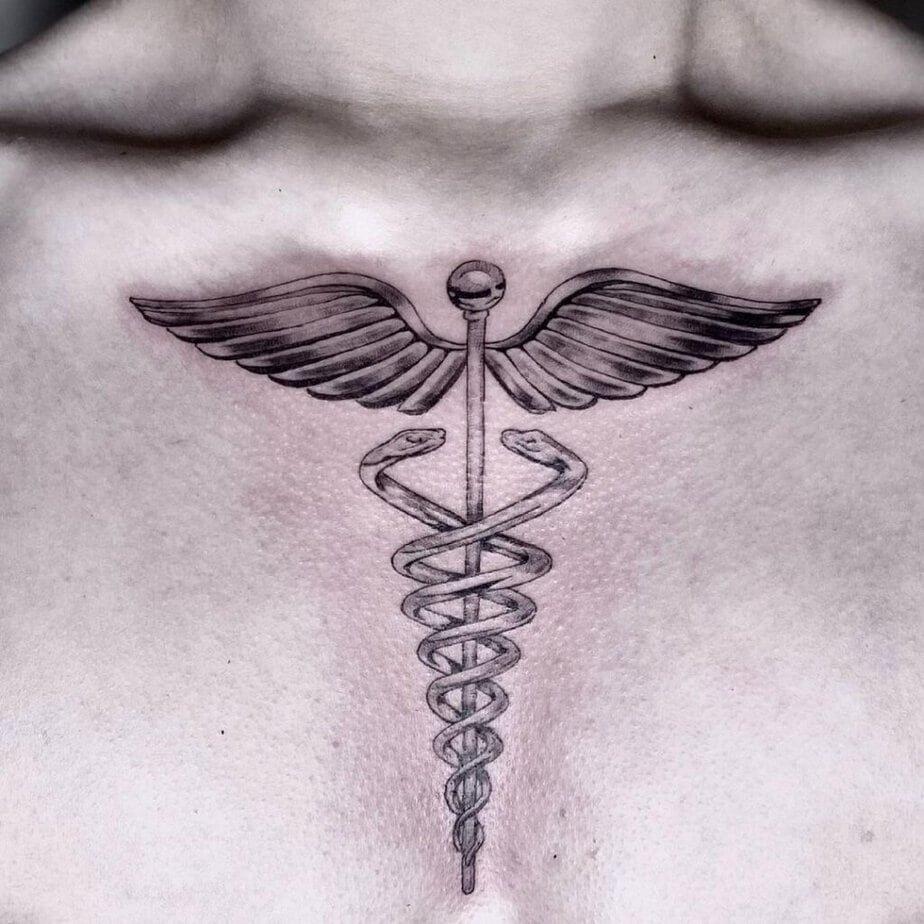
Credit: champagne.ink
Compare that to a smaller, perfectly centered chest piece — it leans into symmetry and quiet confidence. For people who prefer bolder visuals, switching to heavier black ink and stronger contrast makes a modest design read loud and proud. And if you want asymmetry, placing the staff to one side with a few lightning bolts or accent marks gives the tattoo a playful, energetic edge.
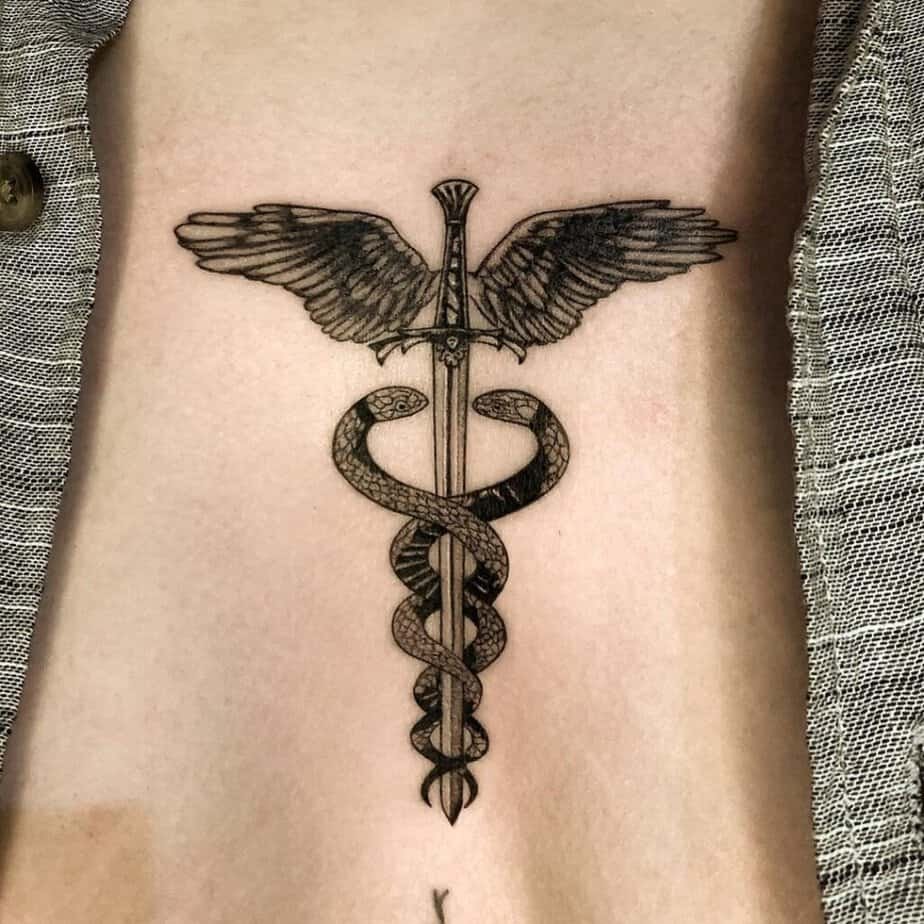
Credit: gcimarmc
Celebrate it on your stomach

Credit: martin_b_ttt
Picture this: a quiet morning, you catch a glimpse of the tattoo at the edge of your shirt and it reads like a small, private emblem. Stomach placements tend to make even bold designs look graceful because the area naturally softens lines and contours. That delicate quality makes it a favorite if you want something intimate and elegant rather than flashy.
Serpents forming a DNA strand along the rib
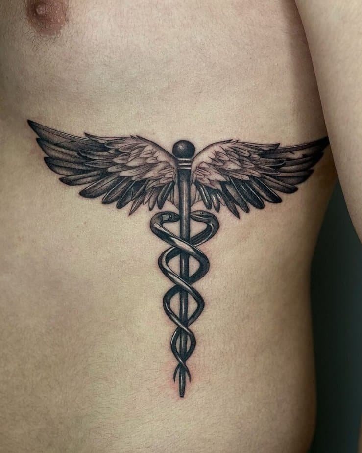
Credit: oaguilarcrafted
Rib pieces are sneaky in the best way: they're easy to hide for work or family, but when you do show them off they read as intentional and artful. The rib’s curve also makes it a brilliant place for flowing elements like serpents, and some artists lean into that by shaping the snakes so they look like a twisted DNA strand — it’s a clever nod to science that feels fresh.

Credit: inkyourskin_amsterdam
Honest note: rib tattoos can hurt a bit more than forearms because of the proximity to bone, but the payoff is crisp shading and gorgeous negative-space highlights. And for those who love color, a saturated palette will make the design pop against the skin in a way grayscale simply won’t.
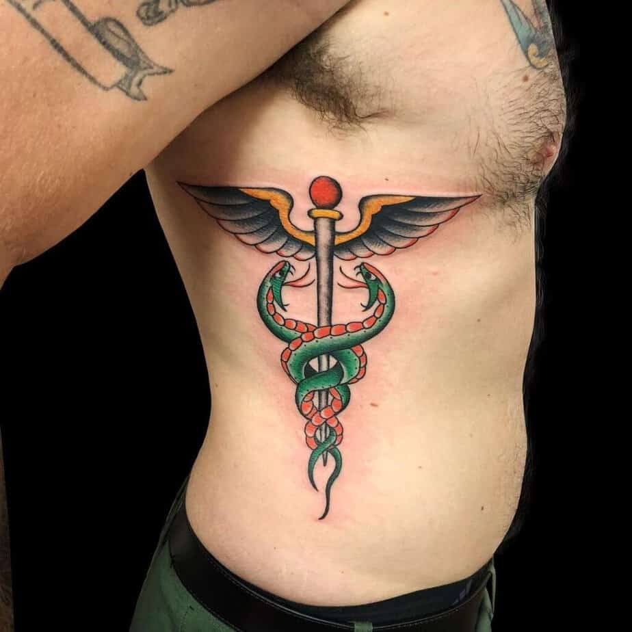
Credit: timbecktattoos
Visible but easy to hide: leg Caduceus
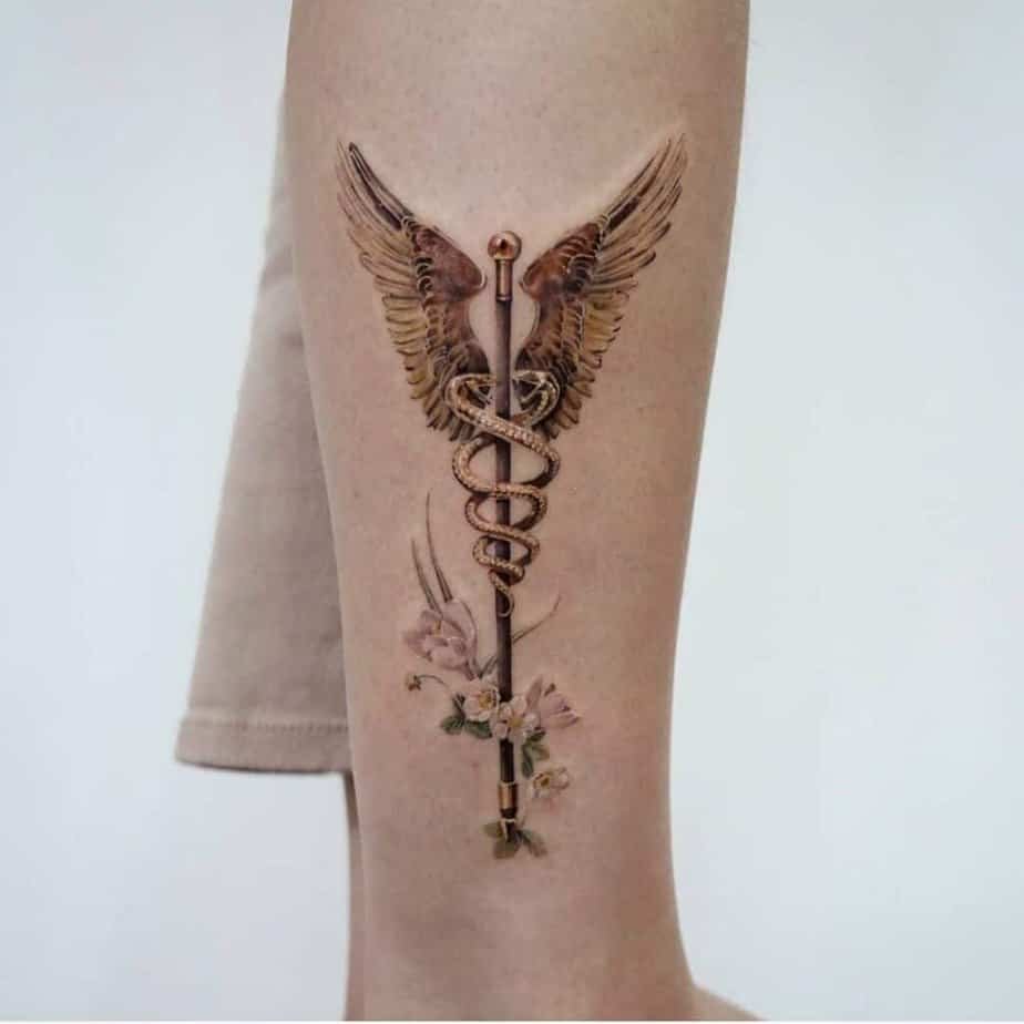
Credit: mumi_ink
I discovered so many leg designs that balance ornamentation with structure — one favorite mixes warm gold tones and delicate florals around the staff, which softens the medical motif and gives it a romantic, almost vintage feel. That combination is dreamy if you want something a little more decorative.
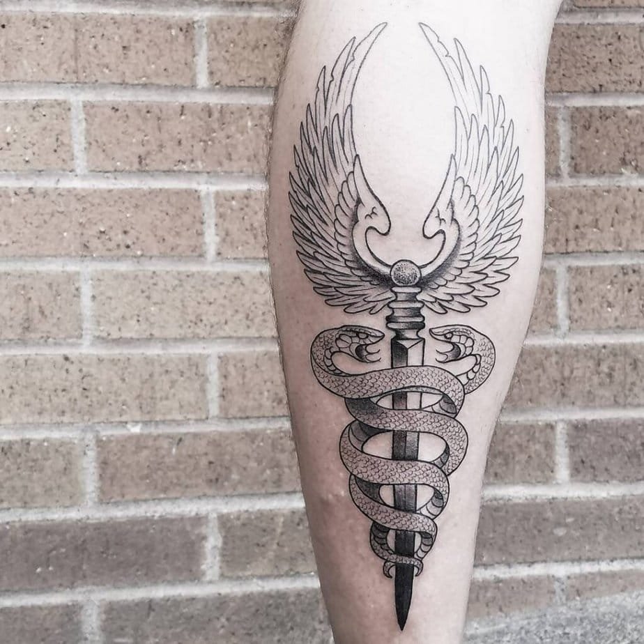
Credit: marcelowhatever
There are also timeless black-and-gray leg pieces where the artist uses skin as a highlight — leaving small negative spaces so the pattern breathes. Those designs age gracefully and read as both classic and modern depending on how much contrast the artist uses.
Wrap-Up
So — which spot feels like yours? Are you leaning toward something bold across the chest, a secret rib piece, or a small, meaningful arm mark that people only notice when you want them to?