Been noticing how people assume faith tattoos have to be loud or solemn — like a banner you put up for everyone to see. But what I love about a small word like “blessed” is how quietly it can steady you. It’s not about performing faith for someone else; it’s a tiny, wearable reminder that the rough parts are part of the story and that something kinder might be waiting down the road. If you’re thinking about getting one, this collection shows how different fonts, placements, and little extras can turn a single word into something personal and real.
Neck placements that whisper “blessed”
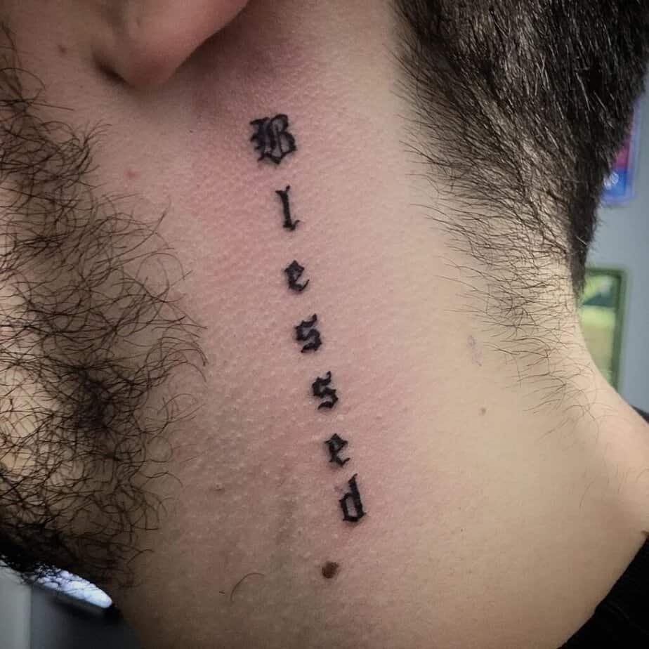
Credit: @byarttattoo
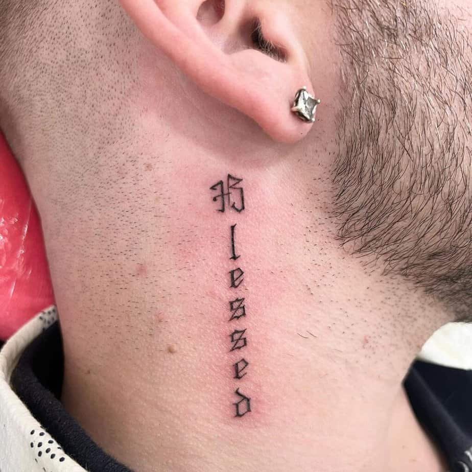
Credit: @evelyntattooartist
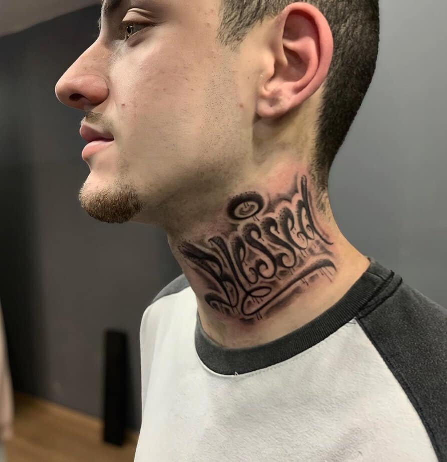
Credit: @mperetti_tattoo
Credit: @abrahamink
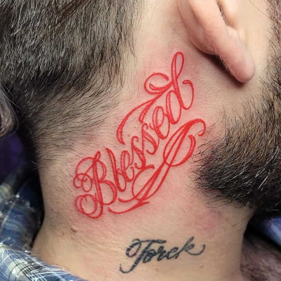
Picture leaning your head to the side at a coffee shop and catching that soft script curving from behind the ear — very intimate, very private. Neck tattoos read differently depending on how the letters sit: a thin, crisp script feels like a secret note, while thicker gothic or graffiti-inspired letters demand attention and feel protective in a different way. I love that some people follow the neck’s natural line so the text wraps and moves with you, and others pick color to change the mood — a red ink “blessed” gives off warmth and quiet romance instead of the usual starkness.
Hand placement — is visibility a problem?
Credit: @benditotatuaje
Credit: @meticcio_tattoo
Credit: @poramoralarte_tattoo
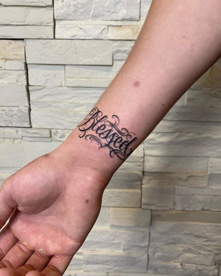
Credit: @art_fromann
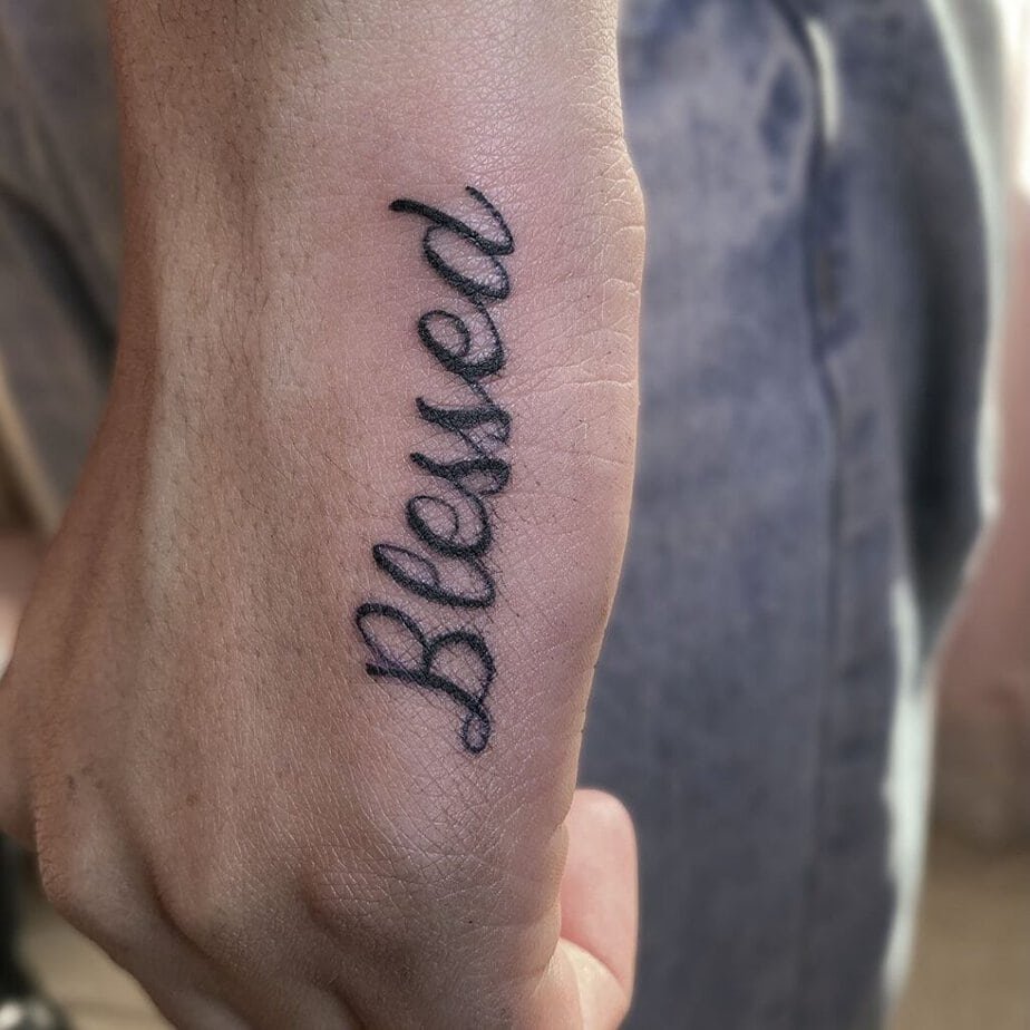
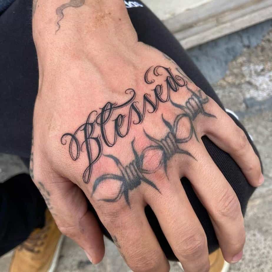
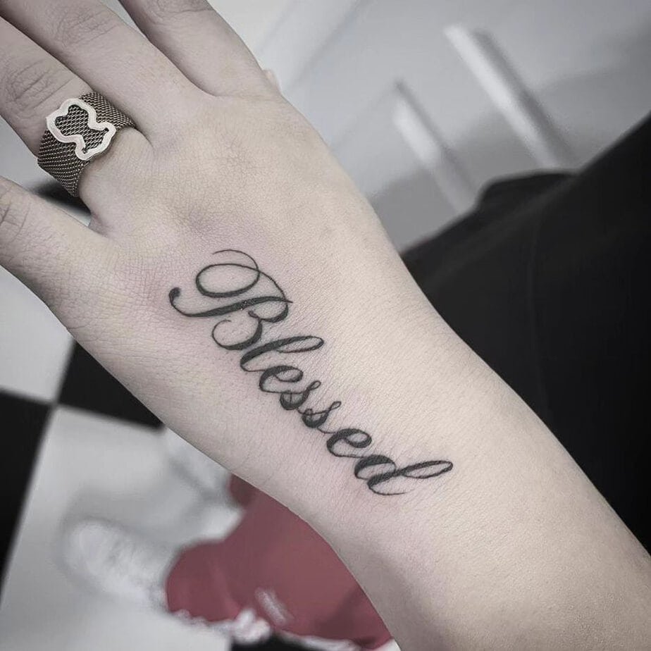
I used to worry hand tattoos would be too loud, but what surprised me was how elegant a short word can look on the top of the hand. Because there’s limited space, the designs are usually simpler — but that makes the lettering choice everything. Sometimes the new word is woven into an existing piece so it feels like part of a conversation on your skin, not an interruption. And if you want a more feminine touch, flowing cursive or a delicate wrist companion works beautifully: it peeks out when you move your hands and becomes a tiny, steady mantra.
Big, bold, unapologetic
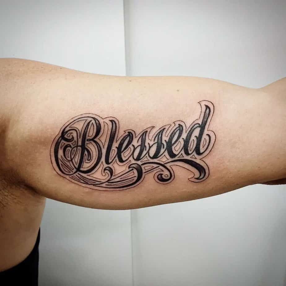
Credit: @brenoparisitattoo

Credit: @mm_tattooer
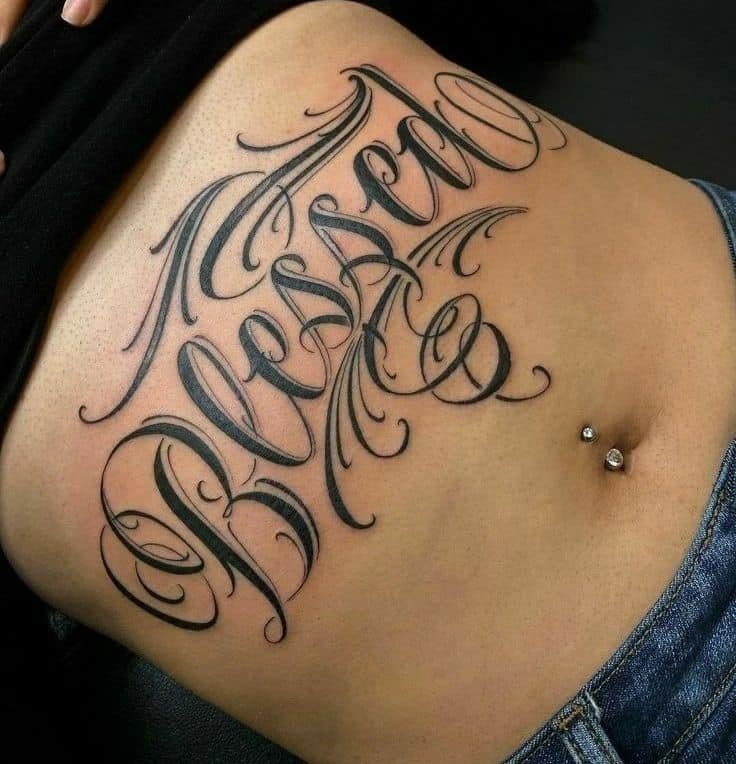
Credit: @tralha_tattoo__mc
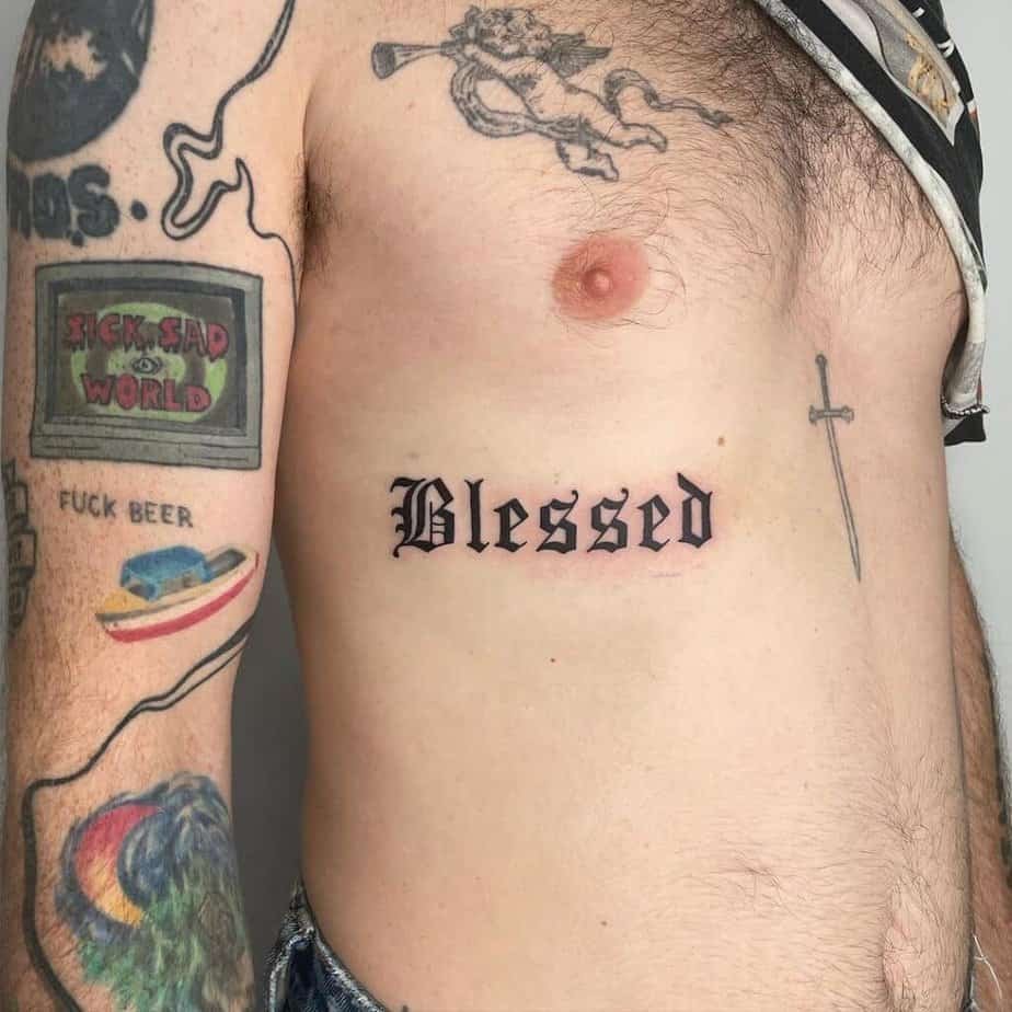
Credit: @kathrills
So if subtle isn’t your vibe, go big. Large lettering across the chest, ribs, or abdomen becomes almost architectural — the lines, the shading, the flourishes all play into a stronger statement. Some fonts feel thorny or heavy, which reads as tougher and more grounded; others use swirls and backgrounds to make the word float against your skin. The contrast between huge, chunky type and delicate floral or filigree details is one of my favorite combos — it turns a single word into a whole composition.
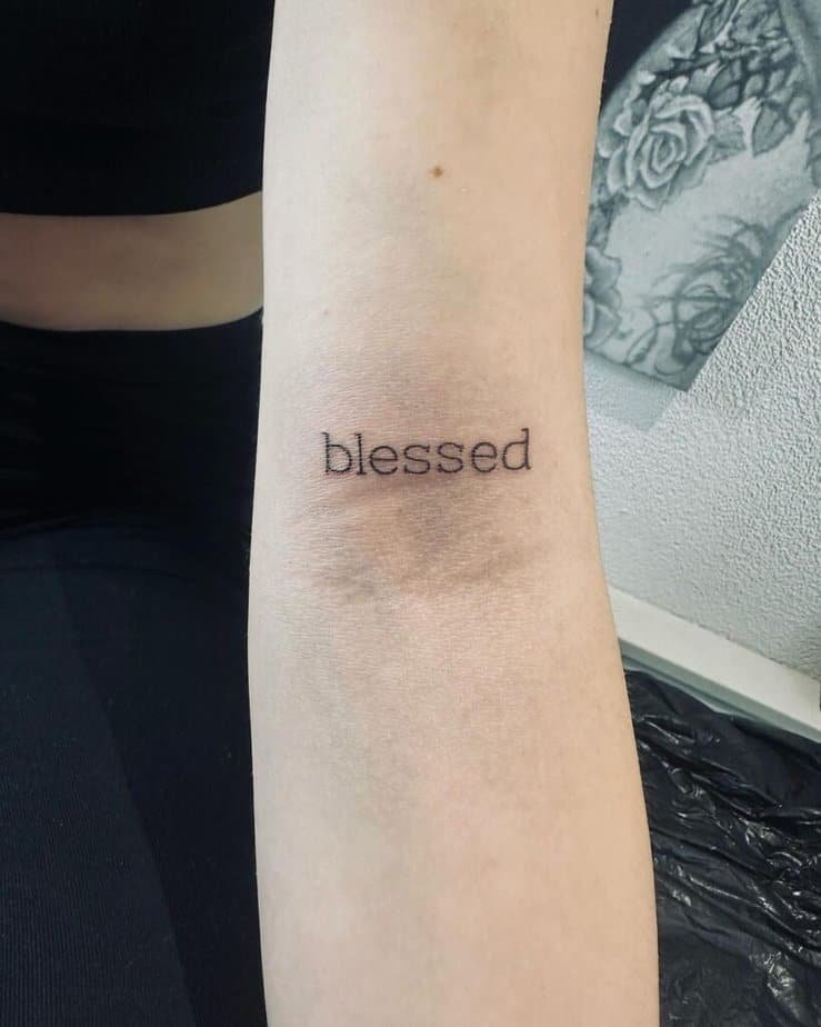
Embrace minimalism

Credit: @skattytattys
Credit: @feel_ink_urdorf
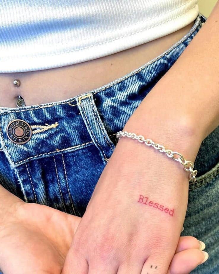
Credit: @atar_bar

Credit: @hugocaldeira.tattooartist
I remember a friend who hid a tiny word on her ribcage as a tether during a messy breakup — she said every time she felt untethered she could touch that small script and breathe. Minimal designs do that; they’re discreet but durable. Lowercase, soft curves, even a little pop of red instead of black can make the word feel tender rather than declarative. Different fonts give different moods: a thin hand-lettered line feels like a whisper, while a neat serif can read as quietly confident.
Cross, rose, dove — ways to dress your blessed
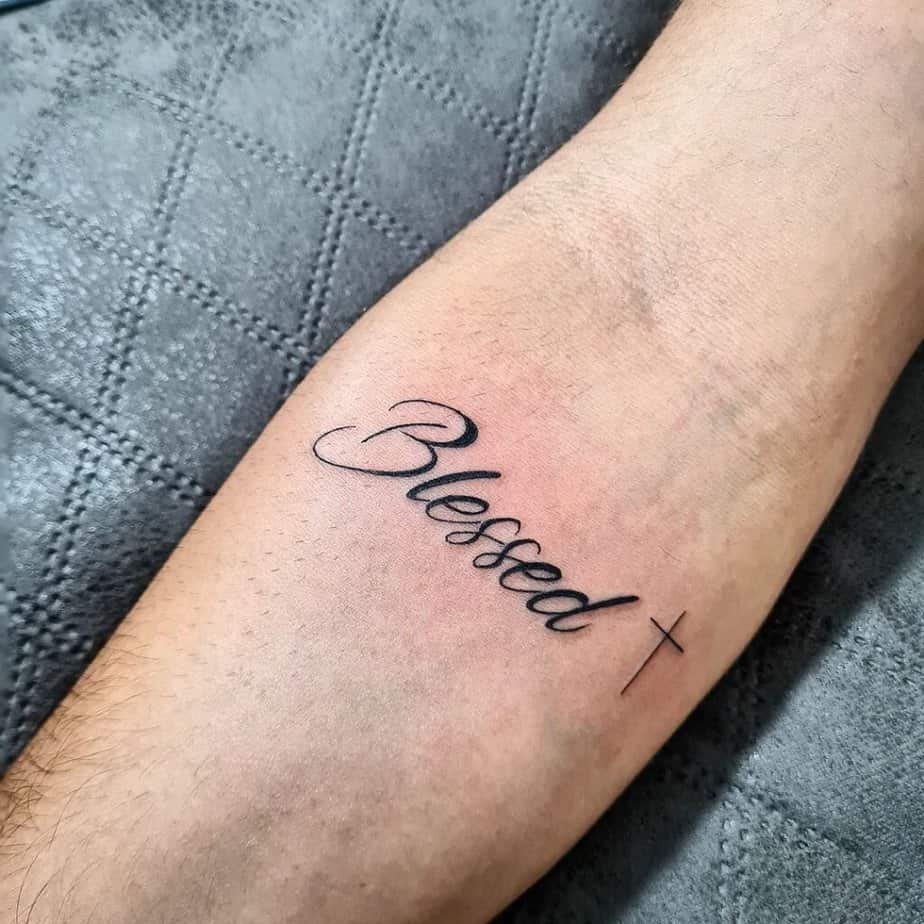
Credit: @carlinhatattoo

Credit: @sebastian_tattoo

Credit: @inkgarage_brooklyn
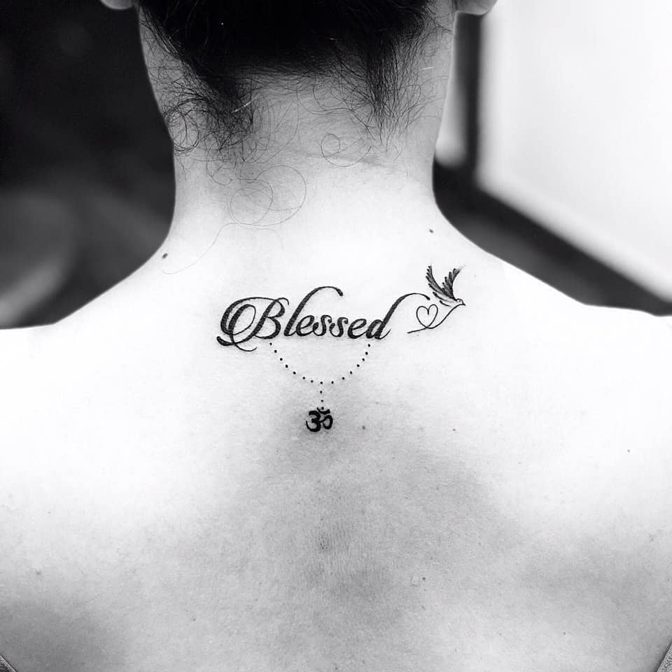
Credit: @tattoo_villa
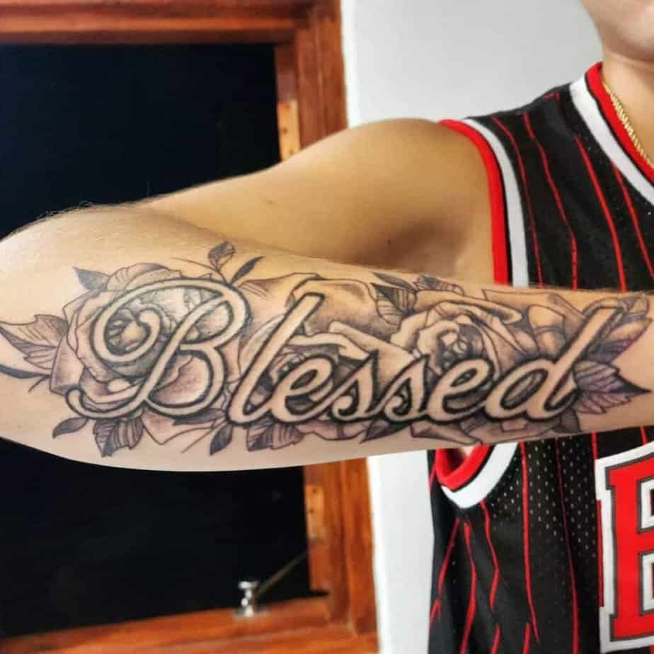
Credit: @h.r.sketches
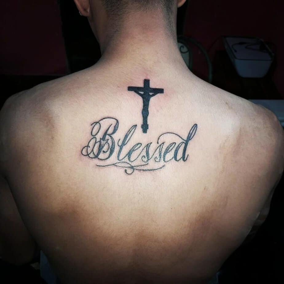
Credit: @pedro_tatuajes98

Credit: @azalea.inknz
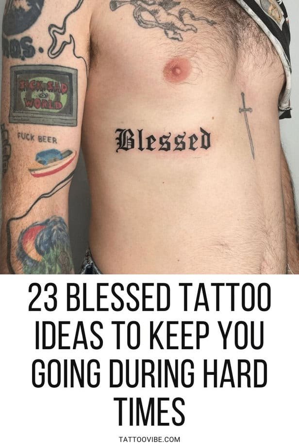
Here’s where the fun starts: adding symbols gives the word a story. A small cross anchors it to a specific faith, roses bring tenderness or memorial energy, and doves or OM symbols can reflect peace or spiritual grounding. Some artists even do the letters as negative space inside a bold background so the word becomes a bright absence against detailed shading — it’s dramatic without clutter. Another sweet option is to use someone’s handwriting for the word, especially if that person is meaningful to you; it turns the tattoo into a literal piece of connection.
Wrap-Up
Do you feel pulled toward a loud statement or a quiet reminder — or somewhere in between? Either way, a little word can hold a lot, and when the lettering, placement, and tiny symbols match what you need, it becomes more than ink: it becomes a companion.