
Been noticing this a lot lately—people keep leaning into tattoos that show two sides of a story instead of a single, neat meaning. Angel-and-devil designs do that beautifully: they’re playful and dramatic at the same time, a tiny stage for the parts of you that argue and the parts that forgive.
These tattoos carry obvious symbolism — angels for light, devils for shadow — but what I love is how they also become a personal reminder. Anyone who’s made a choice they weren’t proud of, or held onto a quiet good habit despite temptation, can wear that tug-of-war on their skin and smile about it.
Picking the right layout or vibe can feel overwhelming — do you want cute, moody, minimal, or loud? I gathered a bunch of directions to spark ideas, whether you want something small and subtle or a scene that reads like a comic panel.
Two sides of one person
Credit: mel.kay_
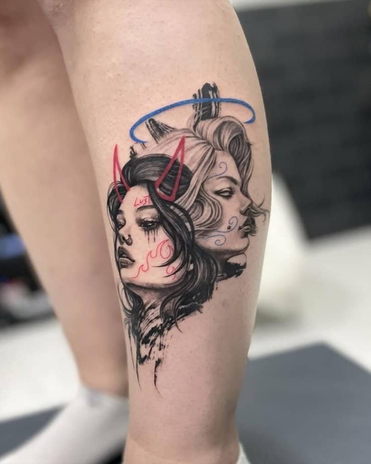
Picture this: half your face lit up and the other half shadowed, each side wearing a totally different expression. That split-person idea lands hard because it makes the inner conflict literal — someone glancing at the tattoo sees a neat visual story, and you get a private reminder that both parts live in the same body. Pops of color, like a streak of red and blue, can make the contrast feel playful rather than grim.
Good and bad?
Credit: tattoosbybetty
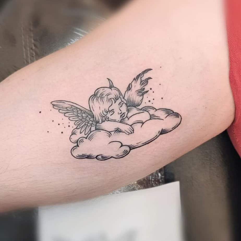
Turns out a cherub with wings and horns is one of the clearest ways to show both sides without getting melodramatic. It keeps the imagery simple but full of personality — a wink and a nudge that you’re not all saint or all trouble. That balance makes for a tattoo that reads quickly and still says something layered when people ask about it.
Fine-line contrast
Credit: tattooer_owen
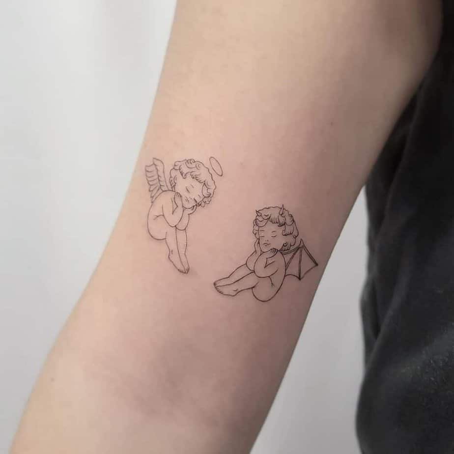
What's wild is how tiny, delicate lines can carry so much weight. Two small cherubs rendered in fine-line work let each figure breathe; they don’t compete for attention, they complement each other. This is a great pick if you want something elegant and understated that still keeps the duality front and center.
See your reflection
Credit: domynykablack
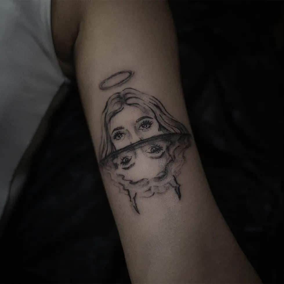
And get this — using reflection imagery makes the concept personal in a way a single figure can’t. It suggests that the version the world sees might not be the one you feel inside, or that your darker side is always closer than it appears. That kind of design invites a quiet, reflective moment every time you glance at it.
Betty Boop, angel and devil
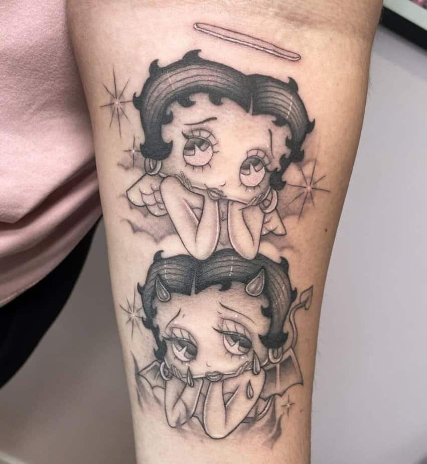
Credit: yherarte
On top of that, mixing pop-culture icons with angel/devil motifs makes the whole thing feel lighter. A Betty Boop riff like this keeps it fun and tongue-in-cheek — the symbolism is there, but the vibe is flirty and nostalgic rather than heavy. If you want meaning without melodrama, this kind of approach is perfect.
Not hidden — split in two
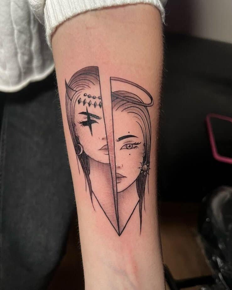
Credit: mars.tattoo.ink
The other part is the graphic, back-and-forth nature of a black-and-gray split: no frills, just contrast. That stripped-back look can actually feel more honest — it says there’s a duality and it doesn’t pretend otherwise. If you want something that reads clean from a distance and still rewards a closer look, a split composition is solid.
Angel wings and devil horns
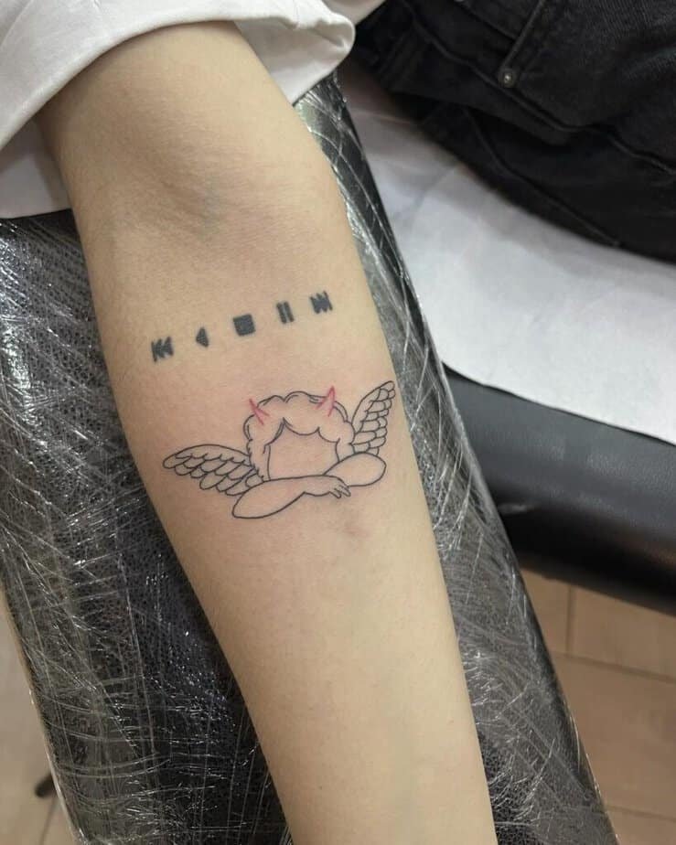
Credit: george_thetattooer
Here's the thing: combining recognizable symbols — a soft wing and a tiny horn — gives you immediate storytelling without crowding the design. It’s relaxed and low-key, great for folks who love symbolism but want something wearable every day. Outlines keep it airy; a little shading gives it life.
Cats as good and bad?

Credit: magda.ink.tattoo
Honestly, animals can make the theme feel softer and more playful. Two cats — one pale and one dark — turn the abstract into something cozy and sly. It’s a neat option if you love animals or want a motif that reads as cute from across the room but contains the dual meaning if someone asks.
Simple outlines
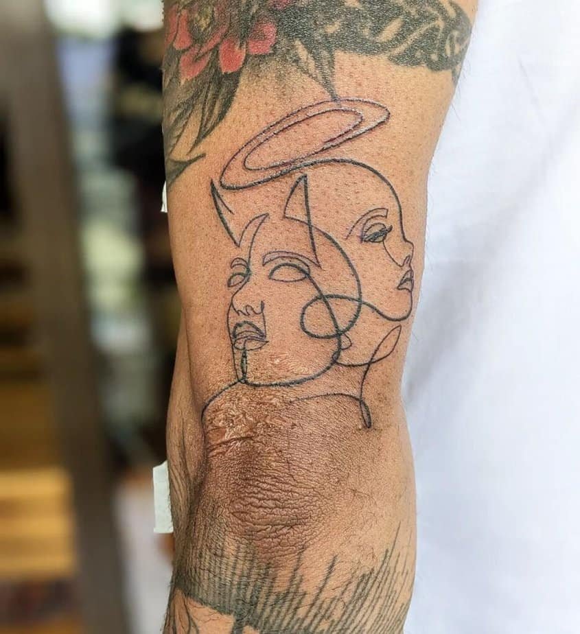
Credit: thelowless
Plus, outlines are timeless. A clean line sketch of an angel paired with a devil silhouette will sit nicely on a wrist, ankle, or behind the ear without stealing the show. It’s a quiet, personal pick — lovely for first tattoos or for folks who rotate ink like moods.
Keep it playful
Credit: katherinejarretattooarchive
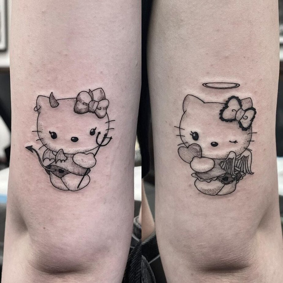
Also, swapping classic seriousness for something adorable lowers the stakes in a good way. Hello Kitty with tiny horns and a halo says I’m into the idea but not taking it too seriously. It’s a good reminder that tattoos can be meaningful and silly at once.
Lettering across shoulders

Credit: monik.tattoo
Funny enough, sometimes words do the heavy lifting. Simple script spelling out “angel” and “devil” opposite each other is minimalist and direct — it’s the kind of tattoo that asks less of an art-heavy design and more of a personal stance. It’s clean and wearable, and it ages well.
Collision: fighting each other

Credit: connorrudytattoos
Surprisingly dramatic scenes — two figures mid-brawl — can feel cathartic. When you want the tension to be visible and almost theatrical, a piece that captures motion gives the idea of struggle a release. It reads like a small myth on your skin, which I find wonderful for storytelling tattoos.
Sipping angels and devils
Credit: la_leti_tattoo
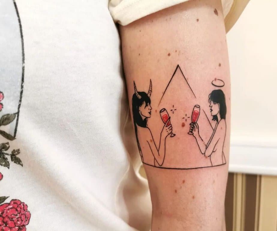
Remember when your inner critic and inner cheerleader just sat down and took a load off? That’s what a whimsical scene — they’re drinking, laughing — can convey. It’s sarcastic and light, and it says the battle doesn’t have to be grim; sometimes it’s part of the daily show.
Angel and devil women?

Credit: ziggiestattoo
If you like bold statements, two female figures carrying opposite energies can feel powerful. There’s a lot of room to play with expression, pose, and styling so the piece reads like two personalities in conversation. It works well as a larger back or thigh piece where the artist can work the details.
Skeletal contrasts
Credit: bloodxbonds
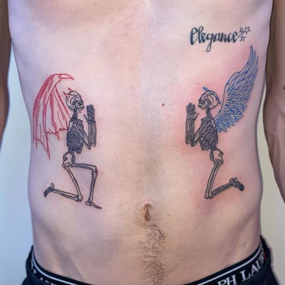
Oddly, stripping the figures down to bones makes the symbolism feel ancient and a little eerie. Using red and blue ink to highlight their differences adds personality without needing faces. It’s a darker, cooler take if you want something a bit gothic but still thematically clear.
Ask: angel or devil?

Credit: welfaredentist
So, tattoos that deliberately muddy the line — a cherub with accessories that don’t match — invite conversation. They mirror those moments when people’s appearances or choices confuse you, and that ambiguity can be exactly the point you want to carry.
Heart split down the middle
Credit: carlos.kristof
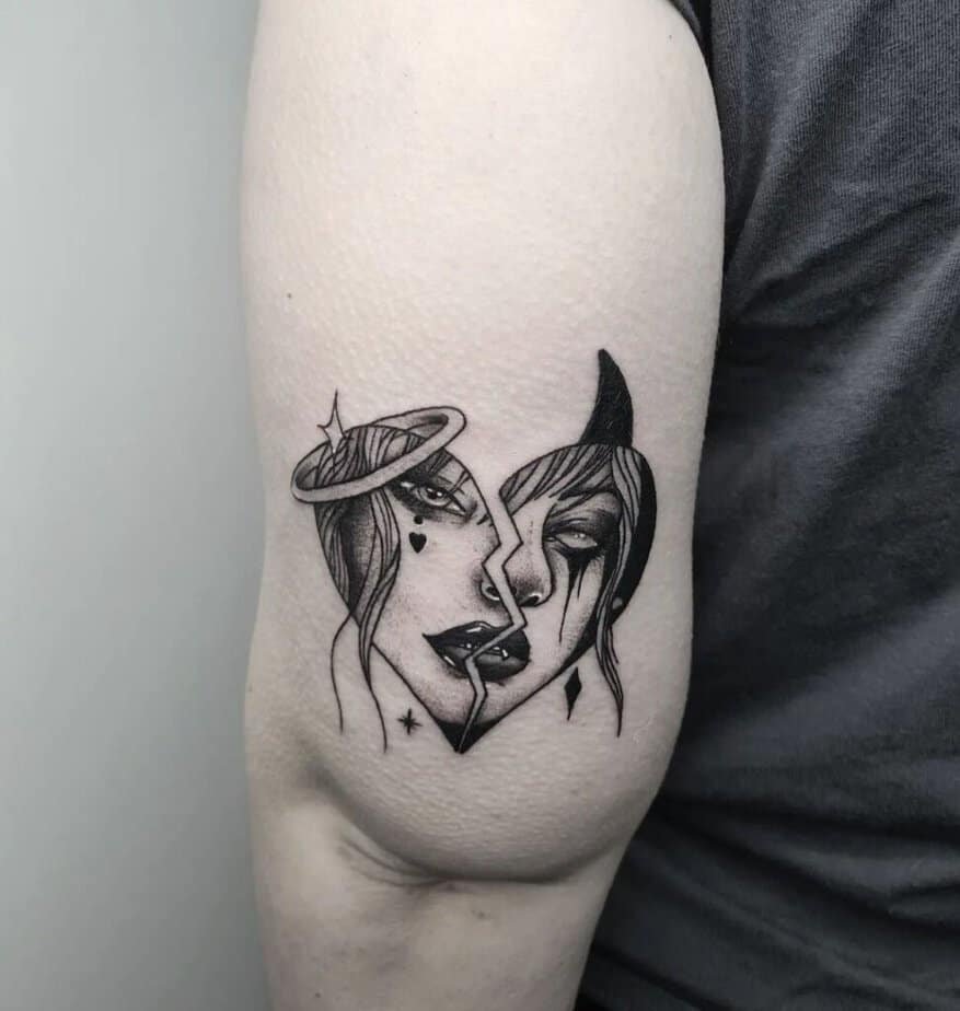
A nice twist is to fold the duality into another symbol — like a heart divided in two. It keeps the message intimate: the tug-of-war lives in what you love. Small decorative details can tell you which half leans at a glance.
Half angel, half devil
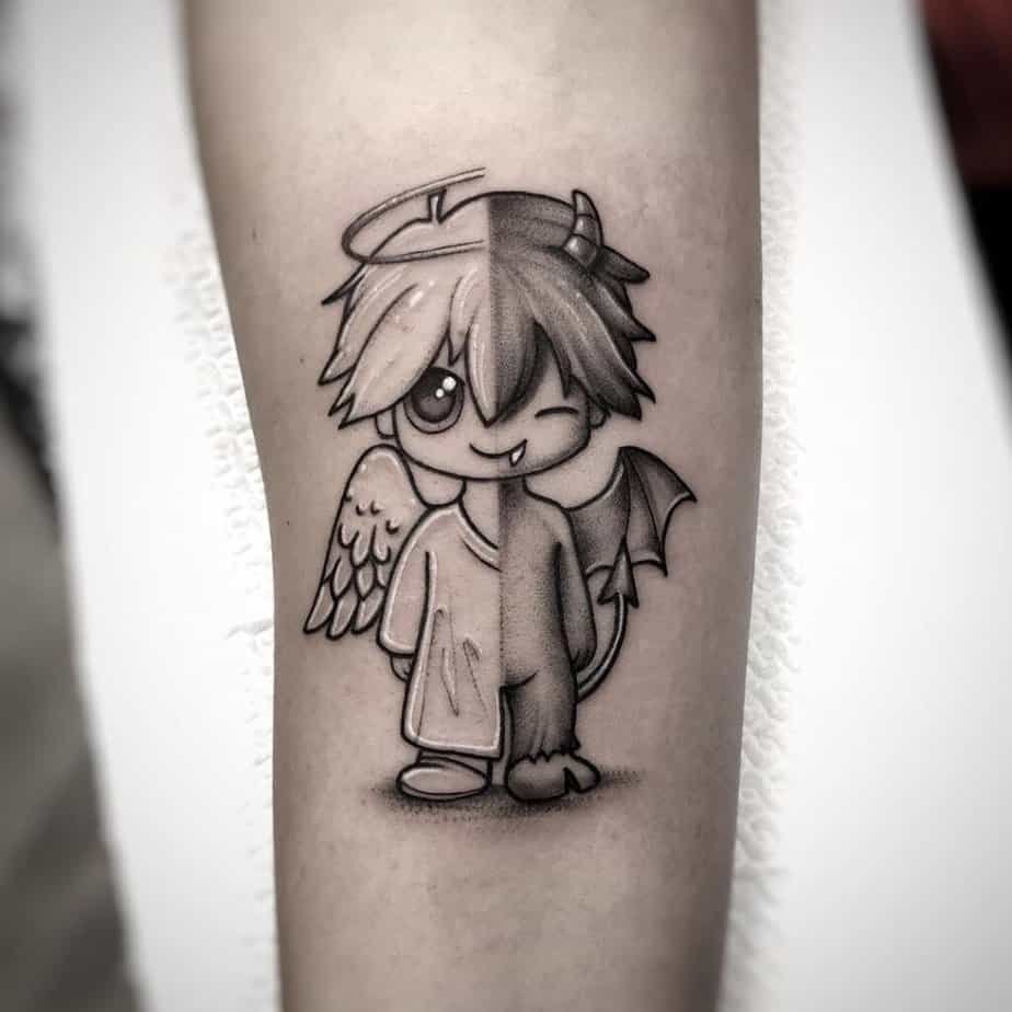
Credit: samantha_lapucci_bangherang_
You’ll notice that a single figure split down the center often feels more integrated than two separate characters. It suggests unity amid conflict — both energies make up the whole person. That can be a comforting message for people reconciling parts of themselves.
Sketch-style women

Credit: luscheggia_tattooer
Like a comic panel, sketchy linework brings movement and attitude. If you want personality and a bit of edge without a full-color commitment, this is a fantastic direction. It feels spontaneous and youthful — like the characters might step off your skin and into a story.
Minimal symbols, big meaning?
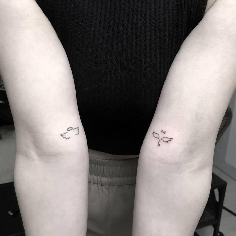
Credit: _lindadoe
For those who prefer restraint, small icons can be more resonant than sprawling art. Tiny halos, little horns, or micro figures tucked behind the ear are subtle prompts you don’t have to explain. They’re also easy to layer with other tattoos later if your tastes shift.
Colorful duo

Credit: tiaani.riches_tattoos
If color’s your jam, bringing vibrant hues into the duality makes each side pop in its own language. Colors can suggest mood, era, or even personal symbolism — warm tones for mischief, cool tones for calm — and they let an artist play with depth and feeling in a way black-and-gray can’t always match.
Pair the cherries
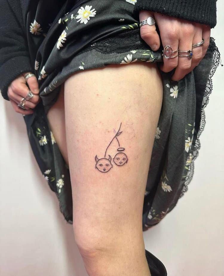
Credit: annapokes
To finish, playful motifs — like cherries sharing a stem but wearing different personalities — are a sweet way to keep the concept flirtatious rather than moralizing. It’s a reminder that the dance between light and dark can be cheeky and charming.
Wrap-Up
So, which direction are you leaning: subtle and symbolic, comic and loud, or somewhere delightfully in-between? I’d love to hear which idea feels like yours — or what twist you’d add to any of these.