
Been thinking about tattoos that actually mean something, and you know how everyone assumes repeated numbers are just coincidence? Turns out, when 555 keeps showing up, a lot of folks read it as a nudge toward change — the kind that asks you to lean into new chapters instead of resisting them. If that speaks to you, getting 555 inked can be more than decoration; it can be a tiny, steady reminder to say yes to whatever’s next. Here’s a handful of ideas to spark how that can look on your skin.
Simple statement
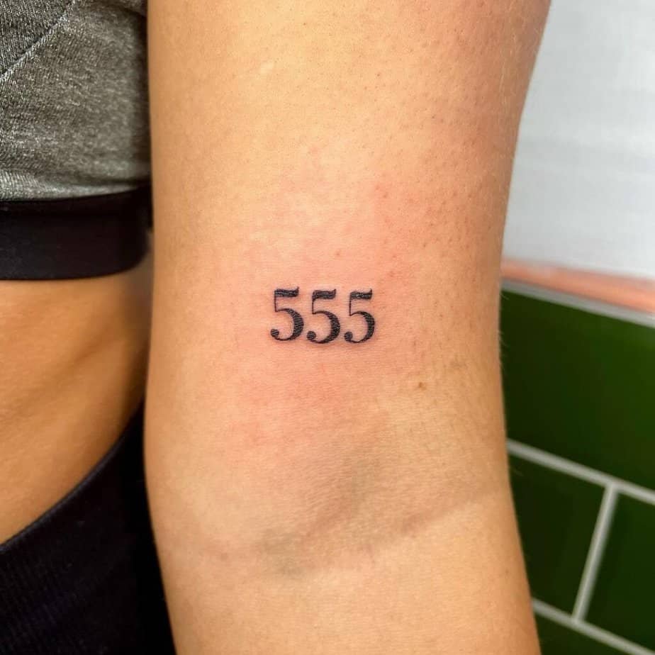
Credit: sophytattoo
Imagine sliding on a tee and catching that little trio of fives peeking out — subtle, private, meaningful. This kind of minimal design doesn’t shout; it whispers the idea of change every time you glimpse it. It’s perfect if you want a daily prompt without turning your whole aesthetic upside-down.
Want sparkles with it?
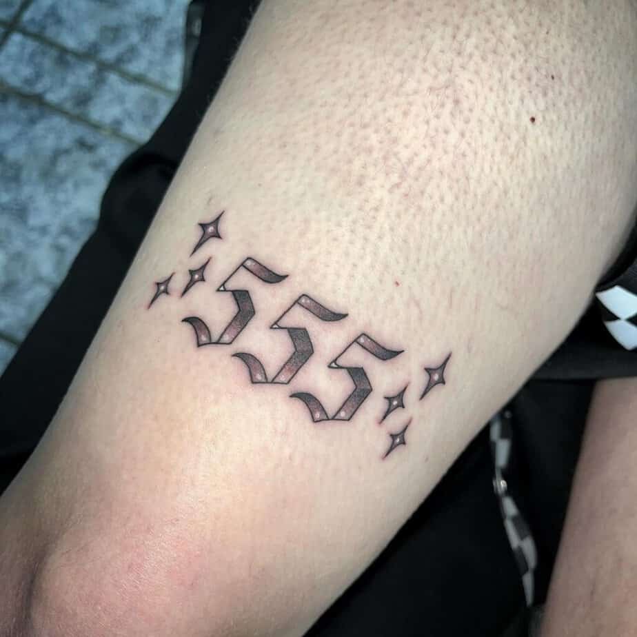
Credit: rachelmarleytattoo
I started noticing little sparkles around simple numbers and realized they do something gentle: they make the piece feel lighter and a bit magical. What’s wild is how just a few tiny points of shine keep the focus on the numbers while giving the tattoo personality. If you want symbolism without a heavy look, this is an easy, playful upgrade.
Motivation under the digits
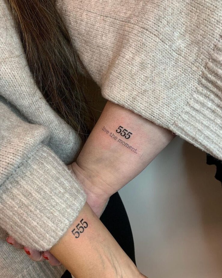
Credit: tattoobydilan
Compare a bare 555 to one with a little phrase tucked beneath — the phrase turns the symbol into a mantra you can read on low days. For some people, the extra words make the change feel intentional rather than accidental. If you want your tattoo to act like a pep talk, pairing the number with a short line does the trick.
Keep it minimal
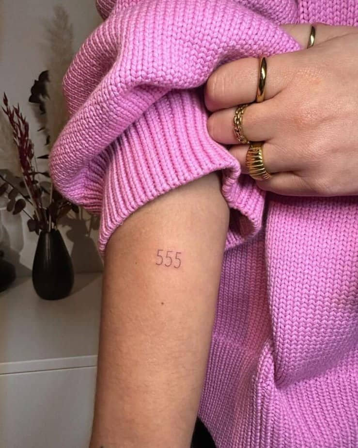
Credit: tw.inked
There’s a calm confidence to a clean, pared-back font — like it doesn’t need frills to say what it means. And get this: when the typography is simple, the tattoo tends to age more gracefully and stays readable over the years. If you’re the kind who likes a quiet statement, minimal is often the most satisfying.
Red ink for a pop
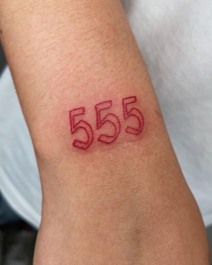
Credit: inkgnorant
Picture that same tiny 555, but in a warm red instead of plain black — suddenly it reads as bold without being loud. Plus, colored ink can change the vibe: red feels passionate and a touch defiant, like you picked change on purpose. Honestly, color is one of the easiest ways to make a small piece feel signature.
Wings meet numbers
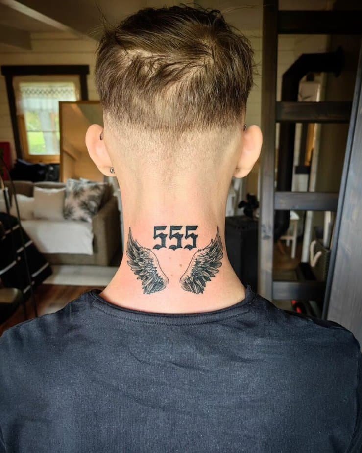
Credit: melaninktattoo
Turns out angel wings are a natural companion for angel numbers — they lean into the spiritual reading without being overly ornate. The flight motif expands the idea of change into protection and guidance, and because wings can be rendered delicate or bold, the whole piece can sit anywhere from a wrist to a shoulder blade. If you want meaning with a little scale, this is a lovely option.
Make the digits bold

Credit: aytugtattoo
Compare the effect of thin numbers to thick, filled-in ones: bold lettering catches the eye and feels rooted, like the change it marks is firm and deliberate. On skin tones that contrast with black ink, this kind of font reads clearly from farther away — good if you want the tattoo to be seen. It’s also a nice way to give the same message a bit more attitude.
Mixed fonts for contrast
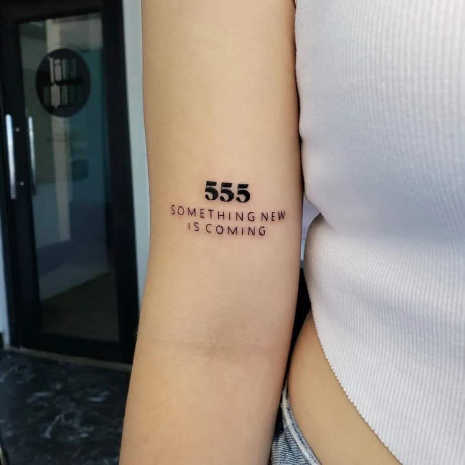
Credit: cristina.tattooart
Here’s the kicker: pairing a heavy font with a lighter script creates a little dialogue on your skin. One part says presence, the other softens it with personality — and that balance can mirror how we hold big shifts with both courage and tenderness. If you like layered meanings, mixing typefaces is a smart move.
Fine-line wings and halo
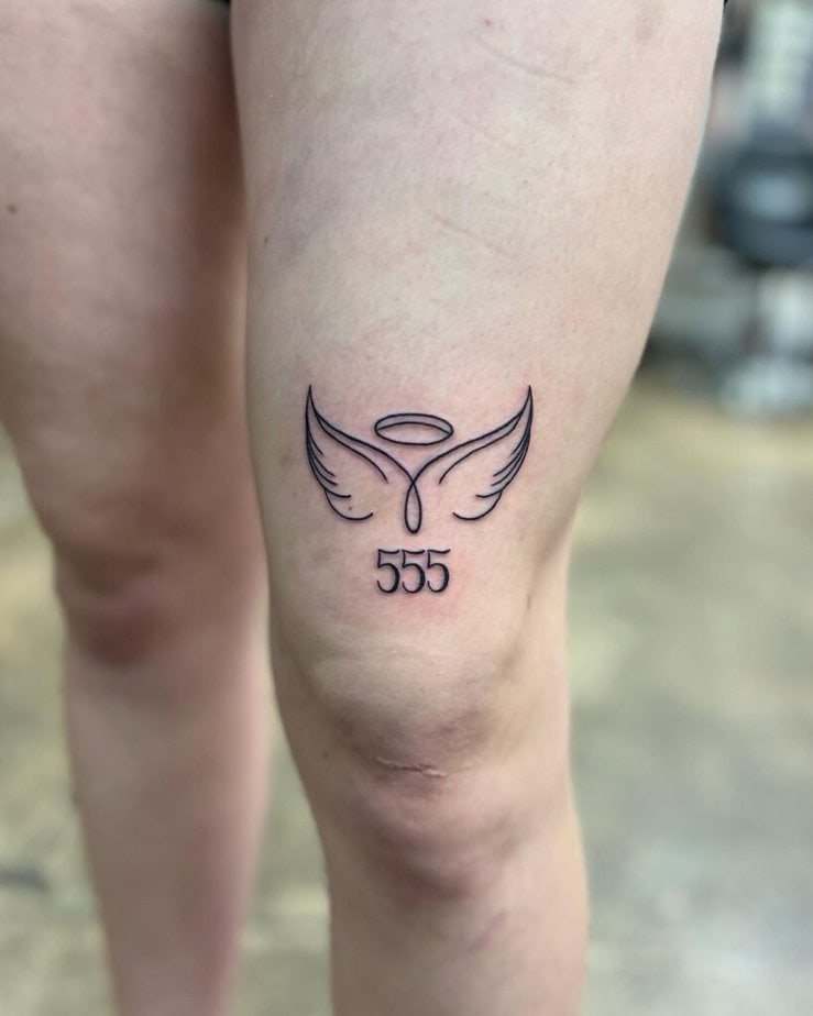
Credit: colorsofthesouthwind
Scene: small, airy wings and a tiny halo framing the numbers — delicate, almost like a sketch. On top of that, the fine-line approach keeps the whole piece elegant and wearable for many placements. If you love quiet symbolism that still reads as intentional, this style is a lovely, subtle pick.
Add depth with 3D
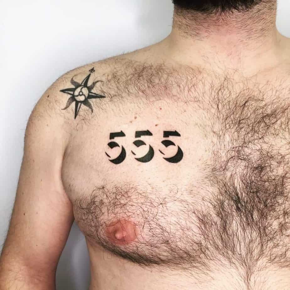
Credit: tabastattoo
A little shading and perspective can make those little numbers pop off the skin like tiny sculptures. What really got me about pieces like this is how playful they feel — they turn a simple symbol into an object you keep close. If you’re into tactile-looking ink, a 3D treatment adds visual intrigue without needing a huge canvas.
Butterfly pair-up
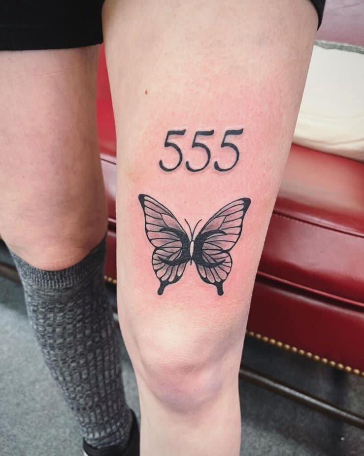
Credit: amberraboin.tattoos
Compare butterflies to wings and you get a soft rebirth story: butterflies literally represent transformation, so pairing one with 555 doubles down on the message. Plus, in black-and-gray styles it reads timeless and a little wistful. If the change you’re honoring feels personal, this combo says that beautifully.
Natural touches
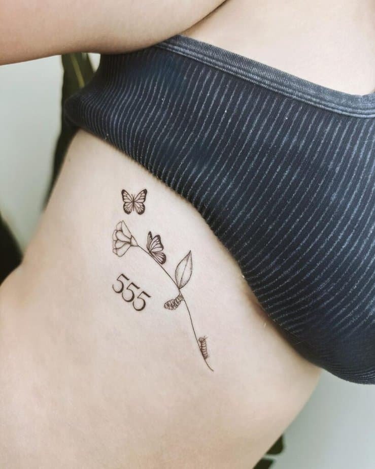
Credit: markbyhaley
A fine-line flower, a tiny caterpillar, and a butterfly tucked around the numbers — that kind of botanical framing turns the tattoo into a little life-arc on your skin. And get this: the imagery reads like a mini-story about growth, not just a symbol. If you want your ink to feel organic and gentle, natural motifs are a sweet direction.
A cherub cameo

Credit: kytarka.tattooartist
Picture a small cherub peeking next to the numbers — playful and a touch classic. The angelic figure leans into the spiritual undertone without making it feel overly solemn. If you want a whimsical spin on divine guidance, tucked-in figures like this bring warmth.
Edge with barbed wire
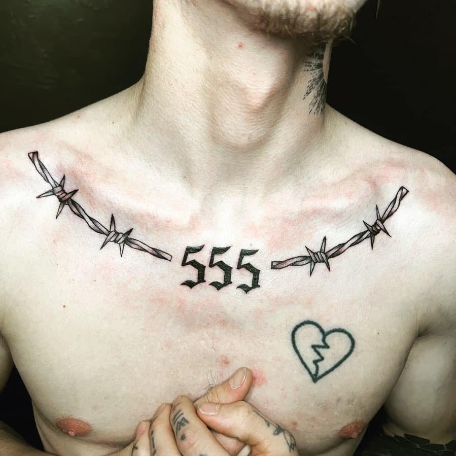
Credit: brookelaurenxi
This one tells a different story: barbed wire next to the numbers reads tougher, like acknowledging that change can hurt but it still shapes you. On top of that, placement matters — a neck piece makes a statement, while the same motif on a wrist or ankle feels more private. If you want grit with your meaning, this is an option to consider.
Butterflies for the neck
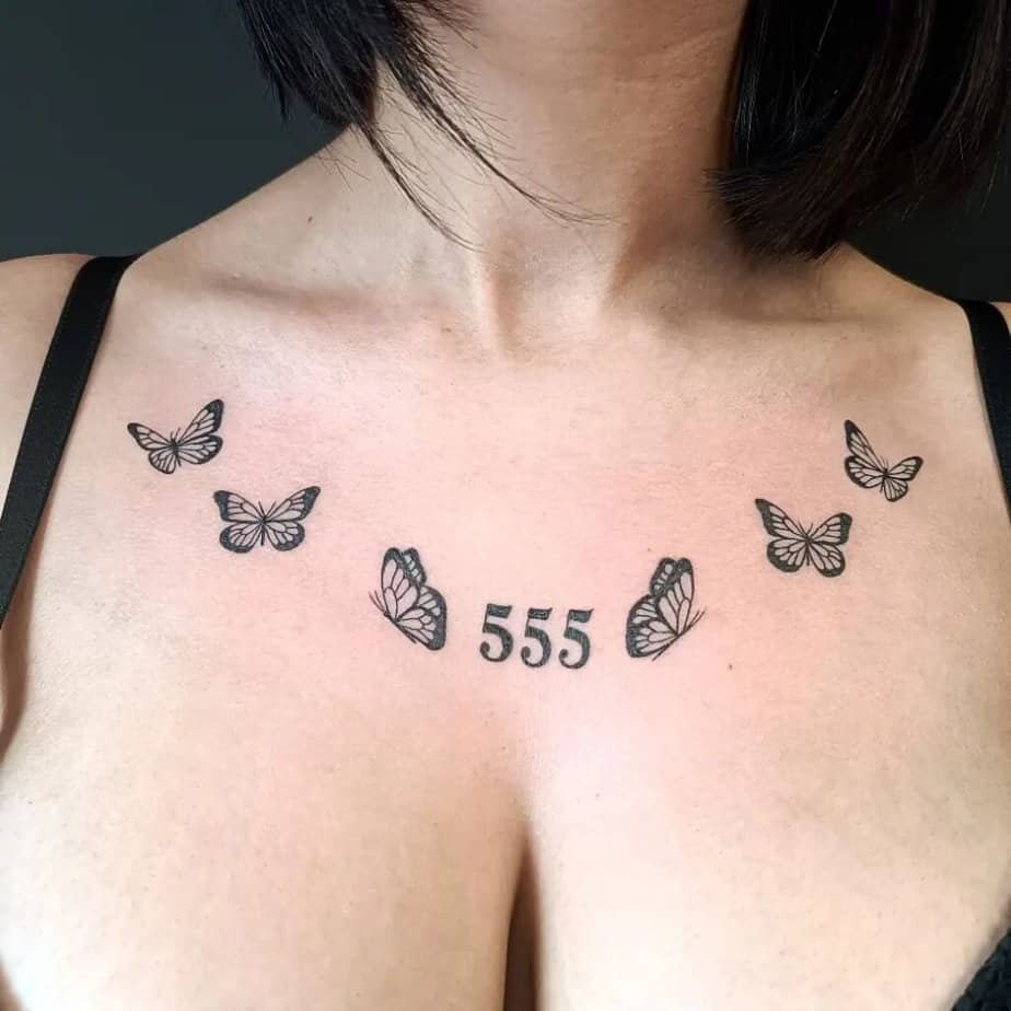
Credit: gemini_tattoo_piercing
Here’s a softer alternative to the barbed look: a cluster of butterflies along the neck reads delicate and hopeful. These placements move with your body and can feel like a small talisman you wear outwardly. If the idea of vulnerability feels freeing rather than scary, a neck butterfly motif pairs nicely with 555.
Dragonfly symbolism
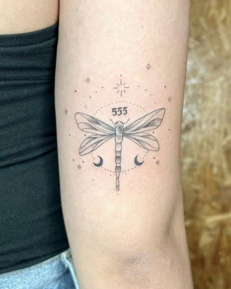
Credit: mello.pintadon
I love dragonflies for this theme because they literally move through life stages before landing into flight — it’s a neat parallel to personal transformation. And the insect’s sleek silhouette lets you keep the tattoo airy and elegant. If your change felt gradual and mysterious, a dragonfly says that without words.
Colorful butterfly and script
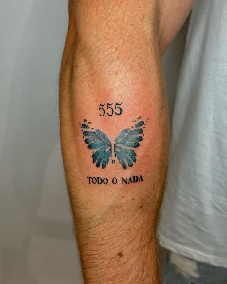
Credit: margarcia.ink
A wash of color can make a butterfly feel joyful and alive, and pairing it with neat lettering gives the whole tattoo a postcard vibe. Plus, color enables personal choices — you can pick tones that remind you of a place or a feeling. If you want a piece that reads like a celebration of change, adding color does wonders.
Katana plus meaning

Credit: juan.san.tattoo
A tiny katana stitched into the composition brings in themes of strength and cutting ties with the past, while a butterfly nods to rebirth — together they tell a clear, layered story. On top of that, the design stays compact if you arrange the elements thoughtfully. For folks who want both resilience and renewal reflected, this reads powerful.
Half-butterfly split design

Credit: itdozmattertattoo
Think of the numbers on one side and a half-butterfly on the other — the asymmetry makes the piece feel modern and intentional. It’s a smart approach if you want symbolism without a conventional layout. If you like art that hints at a story rather than telling it outright, this feels fresh.
Foliage framing
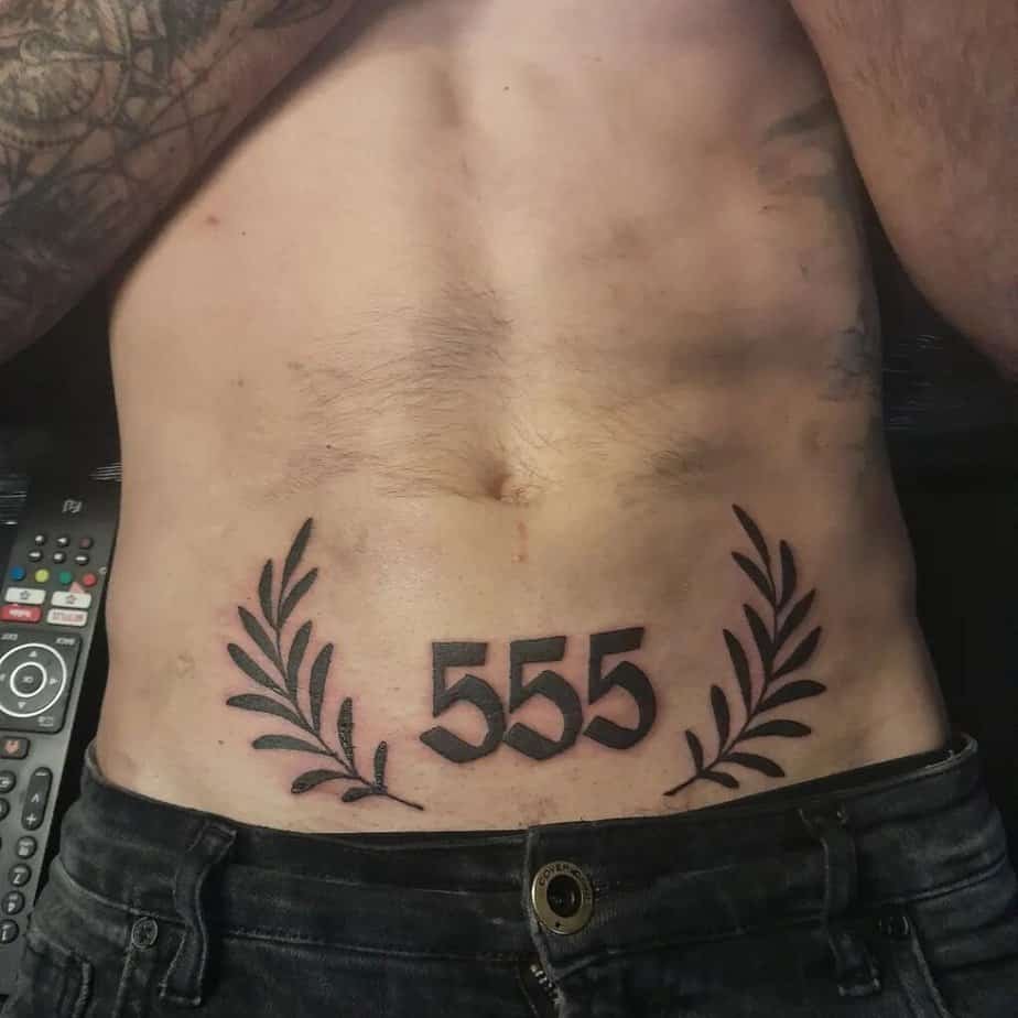
Credit: xristos.petratos
A bold blackwork 555 flanked by leaves reads like a declaration: growth and change, side by side. Plus, foliage can be stylized to match any vibe — delicate vines for softness or chunky leaves for drama. The real question is whether you want your tattoo to be an outward conversation starter or a quiet reminder; foliage leans toward the former.
Wrap-Up
Anyway, that’s my thing lately — tiny numbers, big intention. If any of these spark an idea, take a screenshot, talk to an artist, and make the design your own.